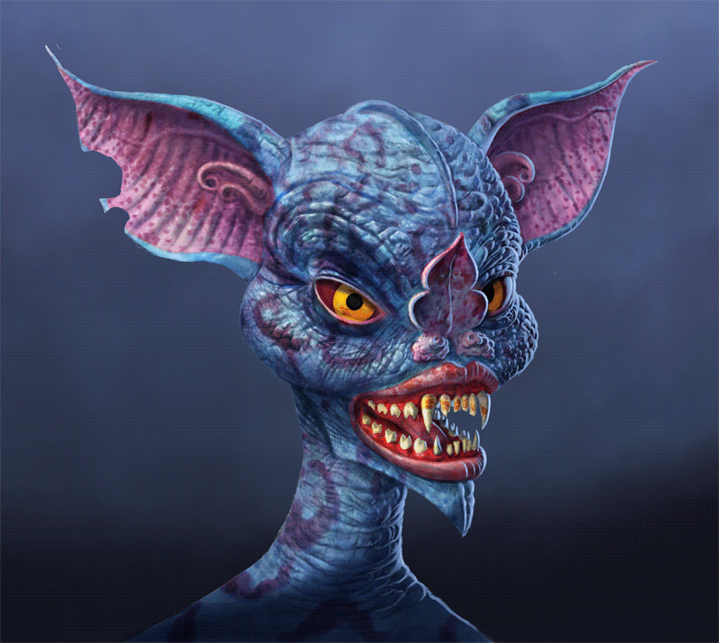

The eyes have been really difficult. I changed the colors, the shape, added veins, a highlight, and ridges on the bottom lids. What makes them so hard is largely the ornate bat nose which bisects one eye. I want partially obscured eye’s pupil to show, but getting it to line up with the other eye plausibly, without making the creature cross-eyed or have the wrong expression, has been a bit of a technical nightmare.
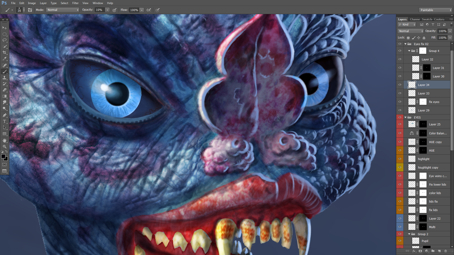
Here’s a detail, and you can see all the layers I have going just for the eyes. They don’t even fit on the screen.
For those of you who don’t know my work, or haven’t heard me say this already, this is NOT my style. This is a standard illustrational approach for digital painting, and one I learned by doing a full online course (one of a few I’ve completed). I’m a fine artist, and I like to do things my own way, so forcing myself to learn from others in order to level up my game can be a bit grueling at times.
Some people have commented about my patience in doing this kind of work. I tend to like to be more spontaneous, too, and it can be a slog doing tutorials and applying what I learn, but the end goal is to improve my workflow from conception to final execution, hone my skills, and ultimately make more spectacular imagery.
That said, I used my own grab bag of techniques to correct the eyes, which are still not perfect, but they are good enough.

Usually, artists tend to settle on a style they are comfortable with (quite probably a good idea), and I had a style at half my age, significantly, before I went to art college. My years through my MFA forced me to get outside of my comfort zone, and do anything and everything else, including installations, conceptual art, and performance art. I don’t know if I ever can squeeze back into one signature style within visual art, but I’m narrowing my range of focus.
My main focus has become digital painting, representational, and heavily relying on the imagination. Unlike the vast majority of digital painters, I’m ultimately doing it for fine art purposes, as opposed to illustration. But to achieve the images I want, I need to have a firm grasp of realism: perspective, anatomy, texture, lighting and shading… Many fine artists can safely sidestep all that — think Jackson Pollock — but for me the most challenging thing is to make realistic imagery from the imagination (others may feel very differently). And I want to be able to compete with some of my favorite paintings from art history, as well as some of my favorite album covers and sci-fi illustrations.
Doing studies and tutorials is associated with being an amateur, and one might think more professional or mature artists don’t need to do it. I rather think continuing to challenge oneself and evolve is merely the mark of an artist who is also an explorer. Expanding my skill-set rejuvenates the landscape of what I can visually discover and manifest for myself and my audience.
~ Ends

Whoa, she is getting creepier, I like all the details in the eyes and skin, great work, Eric!
LikeLiked by 1 person
Thanks Tiffany! Ah, yes, creepier. There’s something to be said for being authentically creepy, in art that is.
LikeLike
The truth here and I am an artist too. I have been seeing this image for days on my feed. The color draws me in everytime. I love blue but this character scares me. Today I actually clicked on your post and here I am. From my perspective this is great.
LikeLiked by 1 person
Thanks for visiting. Yes, lots of blue, especially since I decided to make the eyes blue. Scary? That’s probably a good thing. She’s a little scary, I hope. Should be done in a few days, I hope.
LikeLike
The highlights in the blue eyes are very effective. If you go with the orange eyes you might think about adding the highlights. Now, I am not crazy about the blue eyes. To me they suggest a sweet, thoughtful being. Maybe a pacifist, an idealist. She could have a rose behind her ear. The orange is more animalistic. More alien. I like the idea of “metal” as in your title. Metallic eyes would be pretty creepy. Copper. Brass. Cold steel. Is she supposed to be creepy? CoVid originating bat creepy? And, what happened to her ear anyway? Black eyes are creepy but they have probably been overdone already. White eyes? Rainbow eyes? Spiral galaxy eyes, stars being born while we watch? Red is too common. All the devils and daemons have red eyes. Smoky eyes. Ultraviolet eyes? Kinda hard to do. Good luck. Keep us posted!
LikeLiked by 1 person
I like you association with blue eyes, because I have blue eyes, but you may have somehow missed decades of demonization of blue eyes. Presently blue eyes = evil. From Sylvia Plath’s poem about her daddy, in which she talks about his steely blue Panzer man eyes, to Toni Morrison’s novel “The Bluest Eye”, blue eyes have been associated with the Aryan ideal of the 500 year Reich.
I find that sort of thing pernicious, and blue eyes are just blue eyes. Here they match the skin of the creature.
Because the work is in progress, I hadn’t done any shading on the earlier, yellow-iris eyes. They were still in a more fundamental stage than most the rest of the image.
I like the blue eyes and most likely will keep them that way. To me, they remind me most of Alaskan Huskies, or other dogs that get blue eyes. That’s my main association.
But I like hearing your take, and you have some great ideas for metallic eyes. I will keep that in mind for future imagery.
Thanks for sharing your ideas and reactions.
LikeLike
Very cool. I love the changes to the eyes. Lots of Photoshop layers, wow! 🙂
Antman’s eyes were such a strong part of that piece – especially with his backstory, and the fact you can see an alien horizon in his eyes, mirroring his awakening – so for Batwoman to compete with that, her soul needed also to show up in her eyes. This was a great opportunity you’ve given the viewer, to see a modification layered atop its prototype, and how much that changes the character’s spirit. That nose does indeed look annoying to draw around!
LikeLiked by 1 person
Hi Mike. Thanks for the insightful comment. Gotta’ love it when people remember details and the background story of any of my art.
In this case, because the character is likely in a night environment, being a bat, I can’t reflect the landscape in her eyes. I can’t pull out that trick every time I go to the plate, either, though I got lucky that it worked so well with ant man.
The nose, eyes, and mouth are all very difficult. Usually, when I see someone do something like this these days, they sculpted it in Zbrush or program of choice. I’ve done that as well, and it’s much, much easier.
In fact, I’d say the technique I’m using here (overall), which I got largely from Aaron Blaise, who was an animator for Disney, is NOT up to date. This is at least a decade behind more practical and efficient techniques. However, it’s an excellent exercise in understanding how to make something 3D with only 2D tools. Digital sculpting skips all that because it just goes from 3D to 3D. You make your model and angle it however you like. You can also apply a light source however you like, without having to understand how lighting works. Hell, People don’t even bother sculpting the models themselves, but just purchase them. And most people who look at the finished product don’t know how it was done and think the digital sculptor is a master of painting.
That said, I think digital artists really should learn a sculpting program because it helps one visualize 3D, and it’s also a lot of fun. I combine all my approaches to hopefully make something a bit new and different. Also, while I’m doing this piece as an exercise to learn standard illustration practices, I throw a lot of my own techniques at it, here and there, to kick it up a notch.
A lot of projects I do are experiments, or as in this case, exercises. Other times I try to put it all together to make a larger statement. While nearly all digital painting is done for illustrational purposes, I have a fine art background, and like to blend the history of painting with more contemporary imagery and practices. Oddly, very few people do this that I’m aware of.
LikeLike
I know you decided to make the eyes blue. Not a criticism, just an observation on my part, that I like the way the golden-yellow color works better. Probably something to do with complimentary colors amid all the blue. Carry on!
LikeLiked by 1 person
Yup. I can see that. Thanks for the input.
LikeLike
She’s still getting better.
Imaginary realism’s tough: a could-be space twix isn’t and is; real parts with unreal whole sometimes and unreal parts and a real whole others, gestalt and ungestalt simultaneously and alternating ad infinitum, dizzying, but fun.
Tutorials are the best way to learn new technical skills because all that pesky creative stuff is set aside. When adobe finds a way to make my CS6 extinct I’ll be slogging through tuts for what ever free program fits my needs, oh joy.
Also copying is good, it’s not creative either and it’s the best way to see if you are getting better by simply comparing your work to what you are copying. Studies, too—simply trying some thing different—are good too, who knows what’ll work. Until you try.
Fine art v. illustration. And amateur v. professional. All those labels come down to 1) when you get paid—before or after you do the art, 2) how much—none or way too much—and 3) why: because of the qualities of the art object, or your celebrity as the artist. Yes?
Also it’s mettle.
LikeLiked by 1 person
My CS6 is having problems, and I’m thinking of paying for the new version, which is $10 a month. That doesn’t seem that bad for a program that used to cost around $700. I hate the idea of a monthly fee, but it’s a good deal for the first few years anyway.
Not like Blender, though, which is ompletely free. I was really getting into it, but my computer can’t handle it. Too old. It would overheat trying to do the computations. But Blender is a powerhouse of a digital sculpting program, and absolutely free.
Yup, I do all those sorts of practices. Every one. And I try to figure out how to best incorporate practice and training into my routine. All part of the bigger picture.
The thing that pisses me off, a bit, is I went to college to learn those things, and beyond community college barely learned anything in terms of practical image making. It was all conceptual, and on the graduate level it was conceptual political art or nothing. Not only did I not get the training I wanted and needed, and over years of expensive tuition, I got a load of brainwashing and insidious bias it’s taken me decades to unlearn, or as I like to put it, to “deprogram myself from the art program”.
When it comes to making money, I’m an abysmal failure. Only my patrons keep me going, and I think it’s for my articles rather than my art. I need to work on a game plan to make cash from art. Selling prints when you are virtually unknown, and your art isn’t for the lowest common denominator, and isn’t conventionally pretty, or even traditional, but can be somewhat jarring, isn’t a money-making strategy.
I’d rather just focus on the art, but, I’ll have to dedicate some mental power to making table scraps to survive off of, at least.
Thanks for your insightful comments!
LikeLike
When I was teaching I had to stay on top of every PS revision until ‘18 when I retired. I then quit CC and reinstalled my bought and paid for CS6. The CC subscription model, if you look at it as an easy payment plan is OK, but as you only have it if you keep paying. What happens to your old PSD files when you stop? Looking at it that way, it feels more like blackmail.
Adobe went from a fine tool maker to just another greedy corporation when they went CC. And the upgrades from CS6 on seem to be more bells and whistles (automatizing manual functions) and socializing abilities not necessary for someone who works alone doing one thing. I, being that kind of person will look outside of adobe when CS6 stops working on whatever OS I have to use. I have the free digital drawing only programs Autodesk Sketchbook and Krita already and there are others I’ll try out when I’m forced too.
Art students when I was one (1966-70) emulated the profs’ styles if they knew what was good for their GPAs. The teachers were pre post modernist—abstract expressionists mostly, with a few retro figurative-ists and early onset pop-art-sters—so following along was instructive. We only got one semester to do our own thing, which for me was doing more of what I did in the student newspaper: editorial cartoons and primitive photo printing techniques.
I’m no good at making money as an artist either. Son-in-law Drew Wise https://www.instagram.com/dreweyes/?hl=en is much better at all that. My careers of Illustrating stories w/cartoons and photoshops then showing more earnest than exceptional students how to do that too, were not all that lucrative. And these days, they are even careers!
I had nothing to unlearn from art school, either one of them. Teaching beginner courses in adobe products at a get-a-degree-to-get-a-job school doesn’t have much do with fine/contemporary art world. Nor does my newspaper job as it was close to 40 years of just read a story, make an illustration then move on the next story.
But I did have fun a lot of the time and I believe—or believe I believe—I did some good work, too. But these days, while there are no newspapering, no teaching and no wages, I can’t break habits from those times, so I illustrate my own stories and lecture myself, in other words, I blog.
Don’t give up. Find a mindless, but not mind numbing, job. Teach if you must, but maybe not art. I think my mistake was to try to have both job security and artistic freedom in the same activities. I ended up with not enough of either. It’s not bad now, but I will always believe I could have done better.
LikeLike
You are a m a z i n g……..WoW!!!!
LikeLiked by 1 person