

I do this sort of art sometimes when I need a break, don’t feel like studying, learning programs, looking at references, grappling with AI, modeling, or making sketches. In short, I feel like making art, but I don’t feel like “working”. It’s a lot like doodling, or just picking up a guitar and playing without having anything in mind. It’s also like a game or experiment, because there are a few simple rules. I’m only allowed to work from my imagination; I start with no preconceived ideas; I’m not allowed to look anything up or use references; and I usually use as few tools as possible, such as one brush in Photoshop. This one follows all those rules.
And that’s also why it’s a bit esoteric. The one artist that really comes to mind for a similar style is Alfred Kubin, who died in 1959. I wrote an article about him back in 2018: Eerie Alfred Kubin: Forgotten Pioneer of Symbolism, Expressionism, and Surrealism. He’s not very well known, and I only really discovered him, and became enthusiastic about his art, when I discovered the following image:

When I first saw this image, it knocked my socks off. But I have to be in the right frame of mind to appreciate it, and the same goes for my work in a similar vein. It’s dreamy, subconscious, crepuscular, and Kafkaesque.
It’s also a style I used to practice decades ago, before I had my first computer. I would use charcoal and an eraser, cover the paper entirely with a layer of charcoal, erase into it, draw over it, and so on, until an image emerged. Below, several surviving charcoal drawings using this approach.

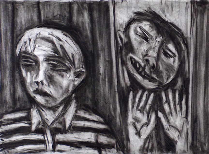


It’s an approach I’m very comfortable with, and it’s fun. I like not knowing what is going to materialize. Discovery and creation are simultaneous. I spend most of my time just looking at it, and then I’ll see something to correct or bring out. It evolves before my eyes. Below, an early stage and the final image.

This style has strengths and shortcomings. It’s not an efficient way of working, because there’s no plan even as to what I’m going to draw, and it generally won’t be very technical (complex machines, anatomy or intricate details]. On the other hand, there’s much more emphasis on shapes and composition.
And in the Era of AI
Another thing I like about this kind of work is that it’s all me. Today, digital artists are struggling with the existential threat of AI, and while there’s a sense that “if you can’t beat ’em, join ’em,” it’s very difficult to use or integrate AI without it taking over. It’s a little like playing “doubles” tennis with a Terminator as your partner. AI is an absolute genius. When I do use it, I end up painting over it entirely and making significant changes, but even then, it’s still a collaboration with digital superintelligence. I’m not talking about the earlier work I did with FaceAp, but the recent, dramatically improved all-purpose AI bots that have devastated digital art. As of now, there are no pieces in my portfolio where I’ve used these new AI bots. I will include them in their own section, because I have wrestled with the phenomenon, but I’m not exactly comfortable claiming something as mine when I partnered with the Cylons.
That’s why this kind of approach, despite its limitations, appeals to me at this juncture. This is as close to working with physical mediums and nothing but my imagination as I can come digitally. This is a kind of art I could do in a dungeon, smearing mold on a stone wall. It’s only what’s in my head and my drawing skills. And doing it digitally has no disadvantages. The charcoal technique was a huge mess; my hands would turn black, there’d be a pile of charcoal dust on the floor, I’d breathe fine charcoal particles, and I’d have to spray it with fixative.
I’m tempted to do more of these and develop the style, but I also know that using everything at my disposal will generally produce more impressive results as far as the general public is concerned.
Interpretation

The title is a giveaway and also a double-entendre. There are two faces, and they could be kissing or about to, even if they are not proportional. But here “kiss of” also means a taste of or a glimpse of. The black head is a silhouette in negative space. There is a tiny drip under its nose (I bet you didn’t notice that) that could suggest a deadly disease. But generally, the silhouette is the contour of the flipside of the dimension of life. The other head is crossing over, and on the far left there’s an opening into the void. Anyone who has read “The Tibetan Book of the Dead” might get the references. It’s a theme I’ve been fascinated with for a long time.
It has a lot of overlap with “Death, Dissolution, and the Void” which I started in 2003.

The Beatles song, “Tomorrow Never Knows” is about these same ideas, if you’d like an entertaining synopsis:
The Beatles focus a bit more on the “love” stuff, whereas I’m more interested in conjuring the experience of crossing over.
I mentioned in a Patreon post that there has to be a bit of a mental leap of the imagination on the part of the viewer to “get” it [or, for those who have read “Stranger in a Strange Land” by Robert A. Heinlein, “grock” might be a better word]. As with my last piece, and “Death, Dissolution, and the Void”, there are 3D illusions that one needs to see before it fully gels as a piece. It’s better to see it as a whole from a distance for that to happen.
Even I need to step back from the computer several feet in order to see it properly. At that distance, the whole image becomes 3D. The large hand on the right suddenly makes sense as resting on top of the picture plane. The black of the silhouette recedes (while also simultaneously having volume) like outer space, dark matter, or whatever is on the backside of life. You eventually get sucked into the vacuum in the upper left. There’s more, but that’s probably enough explanation.
This kind of approach does find its way into my other work and adds a layer of otherworldly subconscious imagination. At the moment, I’m not really sure what I want to work on next. I have several unfinished works I’d like to complete. I could do another one of these. Stay tuned to see.
And if you like my art or criticism, please consider chipping in so I can keep working until I drop. Through Patreon, you can give $1 (or more) per month to help keep me going (y’know, so I don’t have to put art on the back-burner while I slog away at a full-time job). See how it works here.
Or go directly to my account.

Or you can make a one time donation to help me keep on making art and blogging (and restore my faith in humanity simultaneously).


I hesitate to admit that I am partial to the monochrome pieces over the vividly colored ones. I think it may be because it’s a bit harder to distinguish shapes in shades of gray. Once you’ve sorted through several possibilities in monochrome it’s rewarding to claim that you have solved the puzzle, even if you haven’t.
LikeLiked by 1 person
Wait, what? It’s harder to distinguish shapes in shades of gray? I thought it’s easier. Unless you mean that the local color of objects conspicuously separates them. Hmmm. I’m just really curious what you’re saying, because I’m not sure at all. Distinguish shapes? Solving the puzzle?
I wonder if these are concepts you consider when making your own art, but somehow the language is different for me, though I’m pretty sure we have overlap in kinds of puzzles to solve.
Anyway, elucidate if you have the chance. They are interesting concepts I’m not quite getting. 🙂
LikeLiked by 1 person
Color, bright concentrated color that is, usually has defined boundaries which outline specific shapes—at least in depictions of creatures with defined features. Such as many of yours. Take those same features and execute them in monochrome and they aren’t as loudly proclaiming their existence. At least not to my eyes. I don’t think I would view an Ansel Adams landscape that way though, due to the high contrast levels. I guess I’m interpreting the difference between color “values” and monochrome contrast here. If you take a color work with really strong values and convert it to monochrome then yes, the detail is still there. But if the values aren’t so strong to begin with, what you can easily distinguish in colors becomes a bit mushy when translated to shades of gray. I guess that’s what we used to look at in art class when we checked our values by looking at our work through a piece of (usually) strong red cellophane. If the contrast popped when the work was viewed through the monochrome of the colored cellophane we knew we had good “values”. If a work is created in strong monochrome contrast to begin with and the subject matter is well defined then yes, the shapes are quite obvious—a la the previously mentioned Ansel Adams. That’s about as close as I can get to explaining what I meant. Good thing I am not a teacher 😳
LikeLiked by 1 person
Ah, I think I got it! Thanks for elucidating. When you work digitally there are so many ways to use or introduce color, each producing different results. I can think of at least one of my pieces where I really prefer the B&W to the color. B&W allows one to do more with less. Both have their merits.
LikeLiked by 1 person