

If you like painting, photography, and aesthetically beautiful images, you’re in for a treat. Gerhardt Richter’s overpainted photographs are among his most captivating works. They do not combine conventionally beautiful photographs with realistic painterly contributions. Rather, the photos are throwaways, and the paint application mostly consists of chance smears, scrapes, drips, and pressings of paint. He didn’t want the content to distract from the more subtle meaning that the juxtaposition of photo and paint produces. As with all the artist’s work, there’s a philosophical component: here a meditation on time, everyday reality, beauty, and the relation between the ethereal image and the tactile matter of paint. They are experimental images, and the glue that holds them together is the keen eye of one of the most profound and accomplished contemporary artists.

Note that at the time of this writing, 72 of Richter’s overpainted photos are currently on exhibit in Dresden at the Albertinum at the Staatliche Kunstsammlungen until the 19th of November.
If you are unfamiliar with Richter’s work, next comes a brief introduction to two vastly different series from his oeuvre, which will help you fully appreciate and savor how this series combines them. Richter is on the cool, analytical, detached, and intellectual side of the spectrum of art, which is probably why he is still respected and considered relevant in contemporary art, even though he is a painter. But don’t click away if you are, like me, on the warm side that favors passion, emotive, rich, dark, transcendent, steamy, or even sensationalist content. Richter has made some of the most sumptuously gorgeous paintings in the last half century that everyone can enjoy.
Introduction With Two of His Series
First, let’s take a look at a group of austere, intellectual, gray paintings based on evidentiary photos devoid of artistry.
I consider Richter a realist, and we’re talking the hard-nosed variety. I don’t mean in the sense that Andrew Wyeth is a realist. Richter is not about intricate and finely detailed renderings of nature. Not in the literal sense anyway.

Nature, for Richter, is the greater reality beyond human intervention and need not take place out of doors. An accidental photograph taken in a grocery store can represent unmitigated nature. “Nature” in this sense is the absence of artifice. And one way to depict nature in this way is to paint the mechanism of photography itself as well as the subject of the photo. It’s a very self-reflexive kind of art.
October 18, 1977 [Photo Paintings]

One of his most famous series [which I saw at the Museum of Contemporary Art in Los Angeles] was based on newspaper and TV images that came from police photos. Here, a fine artist deliberately selected low-quality replicas of Plebeian police photography as the source for his painting. Compare this to the highly detailed pencil drawings of professional stock photos, usually of alluring women, and best if covered with liquid or seen through a veil, endlessly circulating in social media today.

By choosing bad reproductions of banal photographs, Richter makes photography itself impossible to miss and thus the focus of his recreations. The series is called October 18, 1977, and the original photos are of three members of a political extremist group who came to an untimely end on that day. In the act of painting the images, the artist blurred them, making them much more vague and with less detailed information than the already degraded source imagery. If pictorial realism or documentary utility were the goal, then he made already low-quality imagery abysmally worse. And that’s how we know it’s fine art, folks.

Because the source imagery is poor and the artist additionally smeared the images via his painting process, we can’t escape the fact of intervention between the original scenes and the depictions currently before us. While there’s very little factual information, this unexpectedly highlights that a kernel of unvarnished reality still lurks in each canvas. They are ghostly images that have a certain presence because they are mementos of time and lives that have already irretrievably vanished.

The canvases are unframed, and this humble presentation allows us to see where the gray paint has pushed over the edges, taking on the peculiar appearance of an alchemical amalgam of paint and black and white film while also asserting itself as the residue of the artist’s physical act of immortalizing disposable media imagery. It is almost like the idea of homeopathic medicines where the less there is of something, the more potent it allegedly is.

Richter is not known to have cared overmuch about the politics or the tragedy of the events. His comments on the topic amount to a general lament on the excesses of ideology. What really fascinated him was the relation between an event, a factual photographic record of it, degraded reproductions, and then his own personal performance of repainting and obscuring them. Only a phantom image remains forever preserved in the artist’s paint, like a prehistoric insect sealed in amber.

We’ll return to this commemorative function of his art in the overpainted photographs.

Abstract Paintings
On the other end of the spectrum, Richter unabashedly luxuriates in the sensuous overload of thick, glossy abstract paintings executed with a squeegee.

It’s all beauty, the love of rich color, and the vicissitudes of smeared, streaked, and scraped layers of paint. There doesn’t seem to be much difference between Richter’s abstract paintings and those of the abstract expressionists. He’s a bit like Willem de Kooning with a squeegee.

Francis Bacon once lamented that abstract painters had the opportunity to use the most sumptuous colors but instead would employ comparatively bland ones. He compared Jackson Pollock’s work to “old lace”.

He could not have leveled that argument against Richter. Richter discovered a formula that practically guaranteed spectacular results, especially when practiced by a skilled artist with an understanding of color. When you mix colors with a brush, you are more likely than not to produce a muddy mess. But the squeegee either retains crisp, distinctive edges and bold contrasts, or else it creates brilliantly attenuated gradients.

This is not to say that just anyone could achieve similar results using his process, but rather that he wisely honed in on a recipe for success and then, using his expert eye, took it further than anyone else could.

Even beyond the sheer delectation of deliciously displayed arrays of paint set out before us like a gourmet meal, paint pulled, piled, and eroded with a squeegee gives the impression of natural phenomena. There’s always a sensation like looking through a shop window streaked with rain, or glancing in a spotted mirror at a speeding train. This is because of the rife incidental smearing that mimics the blurred backgrounds in photos with a close depth of field, as well as the inevitable spattering of sharp details that have all the precision of finely focused minutia seen through a macro lens. With no subject matter and nothing illustrated, Richter succeeds in using pure physical paint to create an ethereal image with the factual aura of a photograph of a scene. In his early work, he made photographs into paintings, and in his abstract pieces, he made paint into photographs.

Overpainted Photographs
But what would happen if he combined two sorts of pictorial devices: physical, tactile paint, and the factual photographic illusion of space? When conducting this kind of experiment with visual reality, he toyed with our perception of reality itself. There are two kinds of inescapable facts within the same frame. One is the slice of time registered by the camera, and the other is the later instant when the paint was applied on top of it. One is an image recorded by a mechanical device, and the other is the physical artifact of a human action.

Anyone could attempt this combination, but Richter was fully cognizant of its implications. These aren’t just art objects; they are Richter’s experiments, born out of his lifelong fascination with images and how they capture reality. He was attempting through these experiments to investigate, discover, reveal, and conjure a more profound understanding of existence and time in particular, for himself as much as for anyone else. He is a bit of a mad scientist, whose laboratory is his studio.

Richter loved the element of chance. Chance was wild, natural, and because it was unmitigated it had a stamp of reality that an artist couldn’t achieve artificially. He would sometimes press or slide his photo, face down, against paint accumulated on his squeegees from painting sessions. He couldn’t see what was happening and only after turning the photo over would he know what he had. I imagine this has some of the excitement of gambling. Of course he had control. He’d have a good sense of which photo would work well with which blob of paint, pressing and swiping where, how hard, and in what direction. But the imprimatur of spontaneity needed to be impregnated into the image.

Richter used the word “coincidence” a lot when discussing his work, and we could say that he was trying to generate coincidences that would simultaneously be fixed in paint on photo.
For example, this was the first image I saw from the series. I was immediately struck by the fresh visual equation. The title reiterates the day the work was created and tells us nothing else, though it does emphasize the aforementioned instance when the paint was applied.

The figures are standing on a beach, but the green-gray paint spread across the surface conjures a large wave about to crash. We only clearly see a real wave meekly licking the shoreline in the lower right. There’s danger here, as the child’s head is half submerged, and he’d be carried away from his watching mother. The white striations in the paint mimic the rising water in the wave. The beading and curl of the paint at the top duplicate the imminent breaking of the wave. This is a perfect example of Richter’s use of physical paint to suggest natural phenomena. The paint becomes a part of the image, and the image becomes part of the paint.
The pictures and the paint were throwaways. All the pictures were family photos, friends, travel pics, buildings, bridges, and other anomalous casual snaps, none of which made it into photo albums. The paint was leftover on the squeegee and other tools from the day’s work on the large abstract paintings. These works are tiny in comparison, each being around 10 by 15 centimeters (which is roughly 4 by 6 inches). But don’t think the art is trashy because it is made out of elements that otherwise might have ended up in the dustbin.

There’s method in the madness, and reason behind this win-win scenario. Too interesting of a photo would call attention to the subject and make it the content of the art. And while I do see stories in images like the beach piece I just discussed, such occurrences are also likely unintentional and a happy accident. Or, to use Richter’s preferred word, “coincidence”. Had he deliberately chosen the colors for whichever photo in question, the element of artifice would be too great. The photo should appear unposed and devoid of artistic aspirations, and the paint needs an air of spontaneity and surprise. This combo produces an essence of happenstance occurrence that would be lost forever save for the artist’s having fished it out of the stream of time. Better that the fleeting instance of time be otherwise inappreciable so that the quality of time irretrievably passing by is itself the subject. There is always a salty taste of sorrow for time extinguished.

For these reasons, rejected photos and throwaway globs of paint are the ideal materials for the job.
Let’s have a closer look at a few examples of landscape, architecture, and portrait painted-over photos.
Landscapes

Half the real estate of this photo is paint. We can only see the tree-covered mountains in the lower half. But it doesn’t quite read that way, as the paint on the right side recedes into the background because the blues intimate a distant sky. The edges of the paint artificially outline shapes we read as the ridge of a mountain and the outline of trees. The paint on the left comes forward like a canopy over the scene, as if our view were blocked by laundry hung out on the line, or else a curtain of flames. Saturated blue paint in the middle appears as the sky seen through an aperture in the foreground covering.
The ridges in the paint are caused by pressing a paint-covered surface to the photo and then pulling it away. The resulting vertical striations create a downward cascading effect.

A giant wing of thick, molten yellow paint threatens to swallow the moon. The swatch of paint appears to be moving right across the image because it is thickest on the right edge and attenuates on the left. The paint is clearly piled on top of the photo, but also appears as a bolt of fire crossing the sky within the image.

The haze and blurred light in the photo contrast with the splintered details of the paint in a way that suggests a glassy layer between them. I get the impression of looking at a passing landscape through a bus or train window after a bird crashed into it. This image has three levels of depth. You look at the paint piled on top of the photo. You look on the illusory glassy surface, and then through it into the distant landscape.
Architecture

There’s a new technique here. First, the artist made a large vertical swipe with the squeegee, and then he erased into it by swiping away paint with horizontal blade strokes. This makes a visual allusion to lifting the veils of reality. The top stroke opens the sky, and the middle stroke reveals the bridge. Because the horizontal strokes were made after the vertical swipe, they simultaneously appear to be the topmost paint swatches, while if you look at it another way, they are the uncovered image behind. The orange and red underlying paint revealed by a cleaning swipe creates the illusion of ensanguined water rushing across the river. These sweeping effects transform what would otherwise have been a utilitarian snap into an image tainted with the aura of a Biblical-level disaster. Richter may not have intended such readings, nor may he welcome them if applied too literally, but I’m fairly certain he valued the conjuring of a sense of some momentous event.
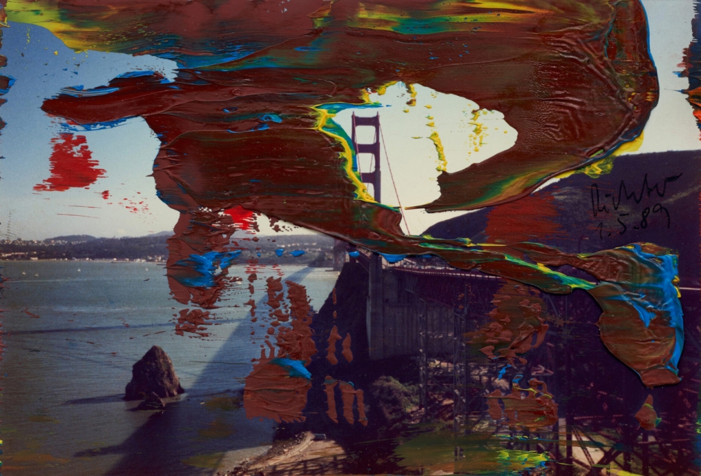
Rusty brine smudges cloak a tower of the Golden Gate Bridge, rising in the distance. The evocation of a process of oxidation and the yellow flickering on the edges of the paint lend an electrical jolt to the image. The overall configuration of the paint evokes the flapping of a wing. It’s as though a photographer had set up a tripod to get this shot, and a pelican flew past right when the shutter clicked. Imagining this scenario, would you say the pelican was flying to the left or right, and why do you have that impression?
It could arguably go either way based solely on the paint, but the shadow cast on the water from the bridge also works as a shadow for the paint, especially because most of the bridge is invisible. The horizontal lines created by the coast, the visible tower, and a post all suggest trailing motion lines, or else the shape of flaps and ailerons on the trailing side of the wing of a plane.

These elements give the image a dynamic quality even if we only register them subconsciously.

You can take a moment if inclined to allow your own imagination to make associations before I share my thoughts.
and
Instead of describing something I see, which in this case is an amusing connection, I’ll just share an image:

I’m not suggesting Richter was painting Spiderman, and I’d even go so far as to say such a comparison is trivializing, but only if one is literal about it. What we really have is a sense of something poised and about the pounce, or even more generally, just the energy of movement that is caused by the paint registering the impact of its application. That said, I do think seeing Spiderman can be a gateway to appreciating the image, after which you can profitably discard it.
Let me give a quick analogy. I took a music appreciation class in college, and after the instructor played the first few minutes of Igor Stravinsky’s Le Sacre du Printemps, or “The Rite of Spring”, a student commented that it sounded like the music from “The Planet of the Apes”. I instantly came to understand the music, but I wasn’t imagining apes on horseback brandishing rifles. There’s an imaginative leap the audience has to make to meet the artist halfway to appreciate the art. The Planet of the Apes or Spiderman are just a nudge that might help some people make the leap.
You may have noticed another striking element of the image. The ridges and valleys in the more muted white and red paint behind “Spiderman” echo the horizontal and vertical lines of the floors and windows of the adjacent buildings. Because the paint repeats, condenses, buckles, and expands the lines of the buildings, it conjures the tremors of an earthquake. This combo makes for a highly energetic image, and if I were working in a high-rise building, I might like to have this work hanging on the wall.
People
Richter aims to reach timelessness and universality through the opposite extreme of isolating highly specific instances of time and place. In his overpainted photos of people, however, because they are his own snaps of family, friends, and colleagues, he gently infuses his own particular reminiscence into the grander memorialization of ever-evaporating history at large.

You might recognize the artist himself in this image, and then the brown mass of color on the right as a woman’s hair, and that her head is turned toward his. The broad white sweep of paint across the top functions like a plank to separate us from the couple in space, which in turn makes our gaze all the more voyeuristic. An intimate conversation is at hand, though it could be about a trivial errand. The rich orange glowing through Gerhard’s backlit ear makes it an irresistible focal point. Various curled shapes between the two heads suggest speech bubbles, and so there’s an impression that Gerhard is contemplating something he just heard.

You could pause here to see if you can find for yourself what’s happening in the photo.
I’d decided this was one of my favorites of his overpainted photos of people before I even figured out what was going on. It was the general feel that hooked me. I was already sold on the contrast between the highly articulated, fluting look of the paint against the softer background, the delicate curved lines of the woman’s hair, and the floral pattern on the couch. For a split second, I thought I was looking at a girl seated at the piano. I noticed an unintentional compositional device. The black shadow behind her knee that is created by the flash photography creates a line that crosses the image horizontally in a zig-zag pattern. I thought it merged seamlessly with black paint, but then realized the black was a skirt seen through the negative space produced by gaps in the orange paint.
Only later did I follow the woman’s downturned head, then guess what she could be holding. Next, I discovered the inside of a baby’s knee. Was she breastfeeding or using formula? Looking for clues, I saw the band of flesh beneath her left forearm, which must be a raised top. It’s a photo of a woman breastfeeding her child. The white in the vicinity of where the child’s head would be suddenly became an eruption of milky paint. The woman’s black dress has turned orange, and, incidentally, this last alchemy may be why a designer used this piece as inspiration for a dress.

After writing this, I showed the image to my wife to get her impression, and she instantly came back with, “It’s a woman breastfeeding”. Guess I was a bit slow on the upswing or distracted by my love of paint.

I was able to dredge up some info on this most dramatic of the overpainted photos. You can’t miss the woman’s bloodshot eyes, and the paint gives an initial impression we are seeing her through shudders. I’m not sure how I would have read this image if I wasn’t already familiar with the artist, his body of work, and his objectives. For example, I knew it couldn’t be something dark. This is his wife after giving birth to their son, hence the red eyes. Even knowing that, I can’t imagine that the green paint slashing across her lower head masks a broad smile. The accumulation of red paint at the far right that matches the blood in her eyes, the streaks it left across her forearm, and the residual smudges of red paint on her face are distressing. This could be a compassionate acknowledgement of the physical ordeal of giving birth, in which case it would be the rare work where the artist overtly focused on emotion. Or it could just be a coincidence. Either way, I find this the most captivating image in the series on purely abstract aesthetic grounds, while also being the one that, intentionally or not, most expresses an aspect of the human condition.
I hope I’ve managed to spark an interest in and appreciation of this body of work in those of you who hadn’t seen it before, and that those who did know it enjoyed my presentation.
It is often said that a test to determine great art is whether it spawns offshoots and influences other contemporaneous or following generations of artists. I’ll end this with a gallery of some examples where I have used the paintover effect in my own art.


Ends
And if you like my art or criticism, please consider chipping in so I can keep working until I drop. Through Patreon, you can give $1 (or more) per month to help keep me going (y’know, so I don’t have to put art on the back-burner while I slog away at a full-time job). See how it works here.
Or go directly to my account.

Or you can make a one time donation to help me keep on making art and blogging (and restore my faith in humanity simultaneously).


Very interesting!
LikeLike
💜💜
LikeLike
I learn something new everyday…thank you
LikeLiked by 1 person
I did find this really interesting, especially as I struggle to appreciate a lot of abstract and impressionistic art. Once you had explained what you saw in these works I could appreciate them far better, but ordinarily I would not have seen this level of creativity, at least not without far more of an in depth look at each picture. It reminds me of a picture on the wall in my uncle’s house when I was much younger. The picture was a large abstract with splashes and dribbles of paint in many colours, thickly applied to the canvas. At first I hated it. I used to look at this abstract work and wonder what my uncle saw in it. But after several subsequent visits and many more viewings of this work I began to see patterns and shapes emerging and parts of the picture looked like they might represent something else. I began to really enjoy looking at this painting. But it takes a while for my brain to appreciate the art. I guess that’s another good reason to persevere with this style of art. The challenge is in the seeing… if it’s too obvious then the brain becomes lazy and dismissive. If it forces the brain to work harder to see the creativity then it opens up a whole new world to appreciate. Thanks for posting!
LikeLiked by 2 people
Thanks, Stuart. It’s great to hear that my elucidation helped you appreciate the pieces more! Been working on the video version which I think will do a better job.
Cheers!
LikeLiked by 1 person
I wish I had time to stare at these as long as they deserve.
LikeLiked by 1 person
This is a great post – educational and interesting!
LikeLiked by 2 people
So now I have a little more time to comment.
I did spend a fair amount of time staring at the two images at the top of the post.
With the overpainted tree, I was saying to myself, “How in the world did he get that effect?” and now I know. Variations on squeegee. Makes me want to get one myself, if I didn’t have so much else going on. I like nature and landscapes, and I loved the watery effect plus the leaves of the tree.
With the Spidey one, my first impression was that the more complex pink and blue part, which mimics the shapes of the buildings, was actually a result of the artist adding his own buildings with a brush. So, instead of Earthquake, I thought the buildings were becoming more painterly and then more so as they moved from photorealism towards some kind of disruption in spacetime.
And a thought just now: Isn’t this how we usually see people? Through a glass, darkly?
LikeLiked by 2 people
Thanks for taking the time to examine the overpainted photos, and to comment!
Yeah, he makes a squeegee a pretty attractive painter’s tool.
Right, the paint almost looks like he’d deliberately gone in and tried to add buildings and effects. That’s the curious thing where paint applied in this way mimics the look of natural phenomenon.
I’ve been working on a video version of this post, which is massively more difficult and time consuming, but is a superior way to share images. Should be out in a few days.
LikeLike
Hi! Been a while – good to see you again. 🥰
WOW. You’ve played matchmaker here: I’m blissfully smitten now by Gerard Richter’s work. Didn’t know much before, just a few references to him, nothing to pull me in. But what you’ve shown & told us has ignited my imagination like fireworks. My mind is dancing in the lights; I won’t waste this feeling.
Thank you!
👏👏👏👏👏
LikeLiked by 1 person
Hi Robin. Ah, glad you like Richter’s paintings. Good to see you “here” again!
LikeLiked by 1 person