
It’s a bit muted right now because I haven’t added any lighting or shading. There’s only a line drawing, with flat color under it. I made it more complex by varying the colors of the sticks that make up our stick figure. That helps to delineate which sticks or branches are which. Incidentally, the ability to add color UNDER a drawing is a wonderful advantage to making certain kinds of images digitally. The base colors of the figure, the line drawing, and the background are on separate layers. This makes it fairly easy to change any one of them without necessarily having to redo other parts. If you’d colored in a conventional drawing and changed your mind, you’d have to change the whole thing. I could change all the colors without altering the drawing.
This was the line drawing:

Right now the color version looks like a cell in an animation. That’s possibly because I’m getting part of this work-flow from a tutorial by an animator.
Below you can compare my version to the tutorial at the same early stage (I boosted the contrast temporarily on mine for the comparison):

The goal is hyper-realism, and the reason for doing it is to practice my skills of observing and creating the appearance of physical reality. It’s also about being more coherent and smart about the process of creating this type of illustration.
I also do things like this:

The digital painting above was done by working directly in color, with no initial drawing, no concept, and only using one brush. The long term objective is to mix and match various approaches, and create hybrids. I’m also disassembling my work-flows and rebuilding them from the ground up.
Here’s the image so far without animation:

~ Ends
And if you like my art or criticism, please consider chipping in so I can keep working until I drop. Through Patreon, you can give $1 (or more) per month to help keep me going (y’know, so I don’t have to put art on the back-burner while I slog away at a full-time job). See how it works here. Or go directly to my account.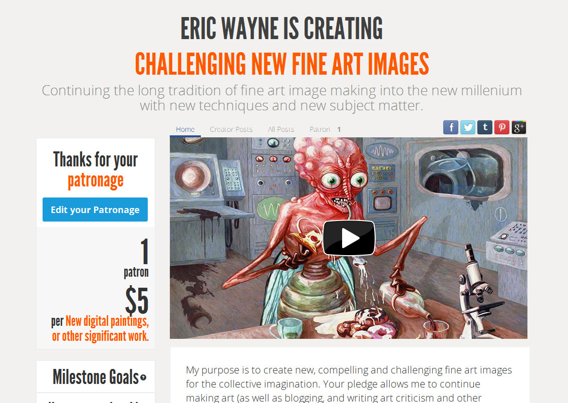
Or you can make a one time donation to help me keep on making art and blogging (and restore my faith in humanity simultaneously).


Seeing this process is really interesting to me as I am starting to do more of an illustrative and abstract style. Maybe one day I’ll try digital. Thanks!
LikeLiked by 1 person
This is really cool! What art software do you use? I have just started digital art recently too so I’d love to know!
LikeLiked by 1 person
I’m using Photoshop for this. If you get the basic package, it’s $10 a month for the new version. I’m using a copy that’s 10 years old, but will update soon. There is also free software that’s pretty good, like Krita. I haven’t used it, but it might be quite good.
LikeLike
I enjoyed your post. I do have one tiny criticism and hope you don’t mind me saying, I found your coloured text background very hard to read. Love the colour just a bit dark for the text and my eyes.
LikeLike
The white text on the dark green background was difficult to read? I think it must look different on your screen than on mine for some reason, because it’s very clear on mine. I can easily change that so it’s easier to read.
LikeLike
Yes the print was black. Weird that
LikeLike
The text is black. Not for me. Hmmm. I’ll go black text on a light color background.
LikeLiked by 1 person
Eric, I Just looked again, the lighter background is good. Thankyou.
LikeLiked by 1 person