This is a re-post of one of my earliest posts from roughly 5 years ago. Then, and now, I have to contend with people dismissing my art entirely with this or that foregone conclusion about using the computer as a tool to make art. Someone recently (OK, yesterday) accused that “the machine” makes the image, it has no emotion, and so on.
I’m working on a longer article dismantling the various blanket dismissals of digitally created paintings, but this old post which shows the process and details of one of my classic works covers most the bases, and you kinda’ gotta’ be a real hard-head to still insist that the “machine” does the work after reading it.
I leave you with my original post from December 18, 2013.
Behind the Human Fly, with extreme details and analysis
I’m going to share what this piece is about, how I did it, and why I think it’s good. If I wait for some critic to do it for me, I’ll need to have my consciousness transferred to a robot host, and then wait centuries before finally collapsing on the bank of some river, midday, in the hopes that in death I can be human again.
Just between you and me, I think people don’t like this piece. I’m not sure why. Maybe it pisses them off, or they DO like it and don’t trust their own gut, or they want to dismiss it as superficial. I dunno. But, here I’ll tell you why it’s good, because I don’t think I’ll be able to afford the operation to become a cyborg, even if it becomes a reality for some. Not only is it good, it’s serious shit.
1) It was flipping hard. What’s so tough about it? Imagining it, drawing it, coloring it, getting the perspective right, doing the lighting and shading, and getting it to all work together. I could have thrown in the towel in a lot of places. And just to give you an idea, there are 40 different Photoshop versions of this in different stages.

In doing this piece, I also invented how to do it. I tried to come up with processes I could repeat, that would be somewhat efficient. So, the whole time I was making it, I was experimenting with how to make it. I did it in a very structured way, going from a line drawing, to adding values, then shading, then choosing colors for each shape, then doing the lighting and shading, then finally painting over it (digitally, that is). In the end I achieved a fully realized incarnation of an imaginary tableaux. This is a good skill to have. If I can create such an image, I should be able to realize just about any other image I can envision.
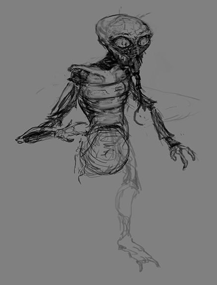
It started out with just a sketch, which I did the day before Halloween. I thought I’d knock it out in a few hours. Uuuuh. No! It took me on a roller coaster ride for over a month. Sketching on the computer is no picnic. It’s harder than doing it by hand, and I probably WOULD do it by hand if I had a scanner. But, the important thing to recognize is that I started with just a sketch. It’s not an illustration of a scene from a movie, and I’m not borrowing someone else’s monster. I created my own version “on the fly”.
The best way to get out of the way how difficult it was, and demonstrate the way I was developing the process, is to use a video of the stages. Let me just make that now.
Just 20 seconds to get the flavor of the whole process.
2) It’s interesting. I know. Some people would think, “according to YOU” or whatever, but, c’mon, it’s a human fly vomiting on his meal, with a row of wall-sized 50’s computers behind him, and his transportation pod in an adjacent room. If someone told me they finished a new work, and I asked what it was, and they said it was their interpretation of “The Fly”, I’d be dying to see it. Wouldn’t matter whether it was the ’86 film or the classic from the 60s. That’s just more interesting to me than a still life, a pile of shit, a balloon dog, a unicorn, or some “random” woman’s boobs. And it’s not a literal interpretation, it’s deliberately retro (the technology), and incorporates humor (he’s barfed on donuts and pizza before eating them). More about the content and symbolism later.

3) The technique. It really does matter how art is made, and how skillfully or imaginatively. I’ve had art history classes, and I can get into the subtlety of composition, color palette, and brushwork. I can really get into the details, and sometimes it’s just the way something was painted that does the trick for me. There are a lot of those sorts of traditional art elements which I like about my piece. I’d ask you to forgive me for being immodest, but I’d be disingenuous if I pretended otherwise. If I didn’t enjoy my own work, I’d find some other hobby to dump all my time in and not make any money off of. So, here are some details that I think are rather good.
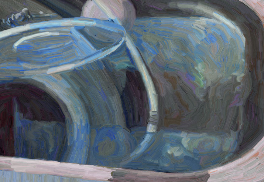
The reflection on the glass suggests mountains and nature, but mostly it’s just a cool effect. And it’s the only escape from the suffocation of the laboratory room!

The brushwork is pretty convincing. No, I don’t use a painting filter. Those can’t do anything like this, and what they DO do, once one identifies its tell-tale signs, just looks like a filter. I did every stroke individually. If it looks Impressionistic, that’s because I have a painting background and have studied the Impressionists. There is no square inch of the image that hasn’t been labored over at least as hard as if it were a physical painting. More about the advantages of working digitally over painting later (selling isn’t one of them).

The segmented wrists are very insectoid, and the other famous versions of “The Fly” don’t have them. It’s also the way I’ve painted the wrists, with the reflections, that mix the future, present and past. The paint handling effect is 19th century, the science 21st, and the props from the 50’s. I’m pretty happy with that bottle as well.
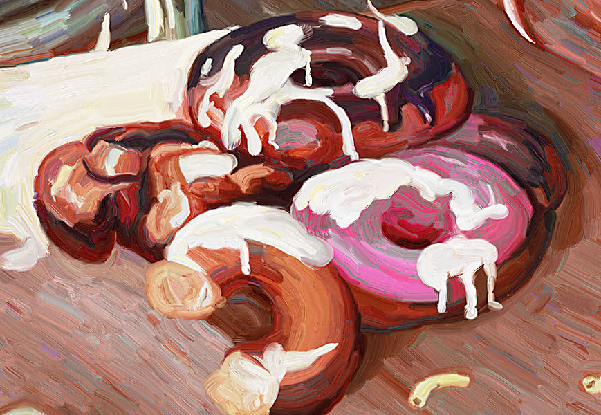
The donuts aren’t quite in it with Eric Joyner’s, which I modeled them after, but then again I’m not a world-famous painter known for his donuts. The table under the donuts on the right is looking particularly good, with a nice blend of colors. Notice that I didn’t just use brown, but a mix of colors, including blues and reds to get a more painterly feel.
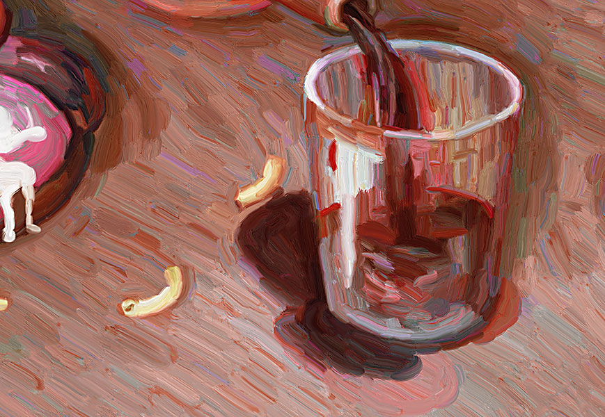
The two cups really demonstrate how much this is a painter’s painting. I should just post them together without the rest and see if people (who don’t know the context or me, really) like them more than the complete tableaux. [Later. I was right. More people liked the two cups than had liked the whole image.]
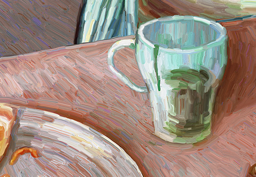
Look at the piece of cheese above. And I got a nice metal feel on that plate, too. I really like the modeling on the glasses, that gives them solidity. And the shadow from the green glass is also nice, especially the way that the brush strokes follow the trajectory of the shadow.
Hope you’re not getting sick of the details. Part of this work is fueled by a love of 19th-early 20th century painting.
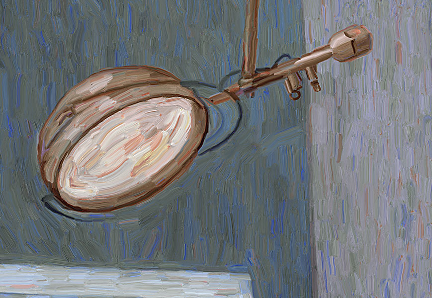
Gotta love using what looks like really thick paint to render transparent glass, and light. Done digitally, using techniques I’ve developed and honed over the years, but I can almost smell the paint. For this lamp alone, I would “like” this painting. But then I’m a pushover for good painting.
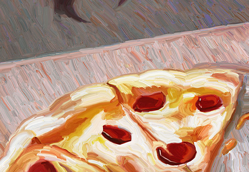
How does one go about painting pizza in a lavish, (Post) Impressionist style?
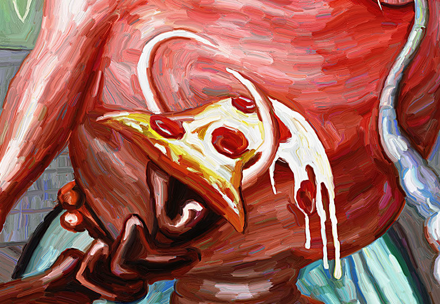
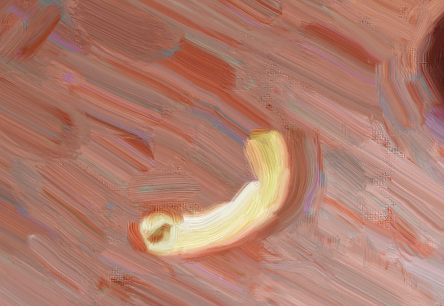
Above you can see another of the segmented wrists. I spent a lot of time trying to figure out how to make it look convincingly like the claw was holding the pizza, and it was folding over and dripping. There’s no tutorial for this.
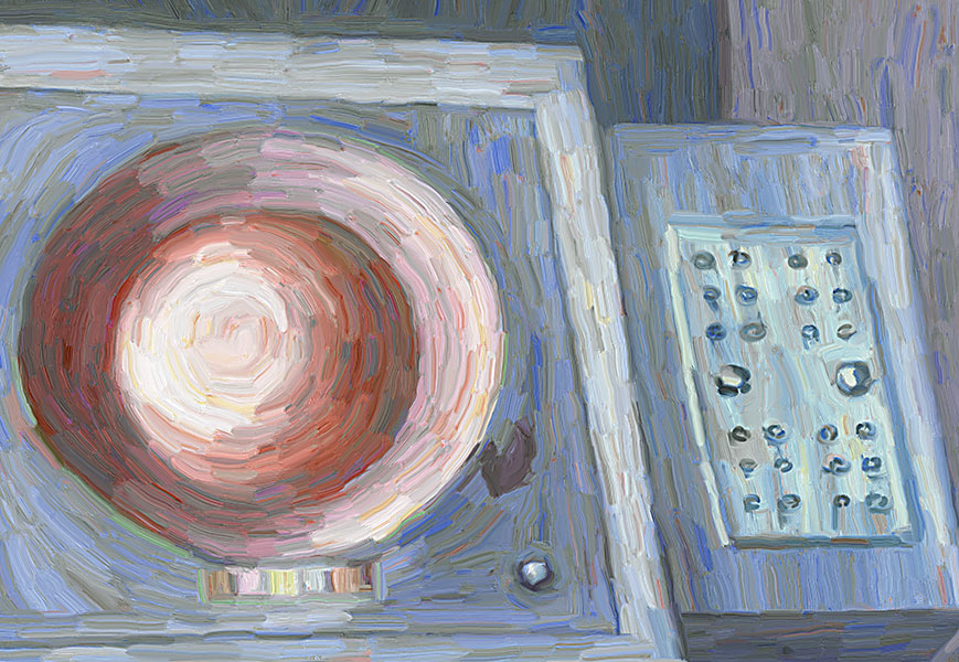
I’m not even sure how I got that console so nice. Trial and error and a bit of luck. I was going for a rough handling of color that would nevertheless suggest detail and complexity. But those circular forms are so beautiful. Note to self… Make some landscapes. Make some money. Put a puppy in there, damnit. That thought didn’t last a second before I started thinking of pics I took of giant green spiders, and that I would much rather paint those.

Often flies’ bulbous abdomens are metallic colors. I was going after green/metallic. I can just sit and look at the different colors in different strokes and be happy with that.
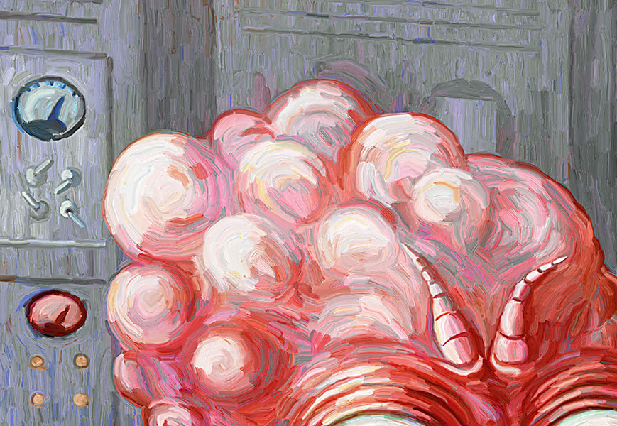
The head tumors – just one of the negative aspects of turning into a human fly – are as beautiful as flowers. Not sure where I got the design for the antennae. Subconscious. Check out the toggle switches.
Just one more.
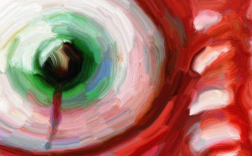
For me it’s important that the iris is green, but has blue in it and some pink. The sweeping stroke melting into the abyss of the pupil was a happy accident. It’s like the eye of a cuttle fish or something. Yes, I do realize the eyes as a whole look a bit like boobs. This just means I can paint boobs later in another attempt to capture the popular imagination. Of course, there will be something to ruin it, just like I ruined perfectly good cups.
3) It’s big. The PSD file is 36X49 at 300 dpi. That’s 3X4 feet at the fine resolution of magazine covers. But you don’t need that tight of resolution because you would have to step back to see the whole thing. It could be printed at 6X8 feet at 150 dpi. However, the best way to display art that was created while looking at a screen, is on a screen. I envision giant flat screens on which digital art can be displayed, say, glowing in a dim or dark room. At screen resolution, this image is 150X205 inches. You’d need a monitor 17 feet wide to show it at full size. Displayed that way, digital art has an advantage over painting.
4) It has all the trappings of traditional art. People forget that art is or was about looking, and that an image is made up of several elements that allow it to speak to you in a visual language – things like composition, color, perspective, form, texture. A lot of art gets rid of some, most, or all of those building blocks (as in the case of much “Conceptually Art”). But this one has them all. It’s even got subject matter and imagination. It’s a fully realized, representational, expressive, painting from the imagination (in 3D perspective). The downside for me is that people generally know how to look at this sort of thing and judge it, but oddly not to appreciate it to the degree that it steps outside of expectation or verbatim preexisting imagery. In other words, it’s easy to shoot down, but very difficult to get up into the air.
Some people might by eager to dismiss it as “illustration”, but it’s not really that. It’s a contemporary subject wrought in a traditional fine art style, and is neither literal nor flippant. It’s Expressionistic, but has a sense of humor. It’s funny and tragic. Tragicomedy.
5) Content/meaning. So, why isn’t a “Human Fly” just some irrelevant cliché from the B horror/sci-fi movie list? On one level it IS just that, and if this were “Conceptually Art” that would be the key to it’s profound contemporaneity, a la Koons’ aggrandizement of balloon dogs. But this guy isn’t like the Alien, isn’t just a scary monster. The monster here is a scientist, and the victim and apotheosis of his own visionary experiment. He is a being, and entity, and all too human. He is the contemporary human, working at home, using computers, scarfing on junk food, and living the life of the mind. He is engaged in an evolution that is destroying him, and is simultaneously doomed and absolutely alive. His aliveness is palpably raw, bubbling, and oozing. Disease and death, on the other hand, are imminent and arise from the same technology he used to make the jump outside of consensual reality. He created new life, like Frankenstein’s monster, but is himself the new life, is his own creation. Now THAT”S performance art. He’s a good metaphor for the artist, though I resist calling this a self-portrait for obvious reasons.
6) The whole. I think I succeeded in bringing all those elements together to create a somewhat claustrophobic room inhabited by a homunculus. To look at it is to enter an artificial space of the imagination. You’re in my head. And you’re in the Human Fly’s head.
That’s my spiel. Here it is again.


The only that that personally bugs me out about some digital art is the very vector based stuff with all clean lines and perfect symmetry but then again a lot of hand done paintings emulate this effect anymore and also give me little pleasure to observe. Your paintings are however not at all in that style and seem full of life so if someone dismisses it simply for being digital it seems a bit like people who dismissed the piano when the harpsicord was the familar keyed instrument.
LikeLiked by 1 person
Yeah, well, what your are saying is perfectly reasonable. You are talking about the result, in a specific case, and also realize your are addressing a style. It’s one thing to say, “I’m not really a fan of Country music,” and it’s another to say, “all guitar music sound like Hee-Haw”.
The people who attack digital art are working with ideas and refuse to look at actual works created with anything like an open mind. They need to believe their conclusion, largely for competitive and defensive reasons: most of these people are traditional oil painters.
So, for example, I’ve been arguing with an oil painter (of still-lifes and nudes) who says that the computer makes the image. When I shared this post with him, he said he didn’t care about my process, the result doesn’t interest him and all digital art is “kitschy” and has an “immature aesthetic”. So, even though I’ve shown that obviously the “machine” doesn’t make the image, he needs to hold onto his conclusion for dear life, lest his own conventional craft has to compete with artists working with other materials and other ideas. The most important thing to take away from his sort of argument, is that his art is automatically better than mine.
The problem is, it’s obviously not.
LikeLiked by 1 person
Fuck that dude. Guy probably just knows he doesn’t know, is too lazy learn, and insecure about the idea of new mediums which could potentially displace him.
LikeLike
Probably a lot of truth in that. I have had the same brush with technology, where I resent some new development and then tell myself I either learn it or learn to live with it. Anyway, it’s not just one dude. I’ve had a serious debate with a gallery owner and a prominent person in the art world, as well as received unsolicited helpful advice from “friends” to stop making digital art. It’s a widespread belief/orientation/mindset. It’s quite alarming how much resistance there is to digital art. That’s why I’m going to write a longer article ripping their arguments to shreds.
LikeLike