
From birthday parties, to showers or a night out with friends, you can reserve our splatter room for a fun get-together. All can join in to make one large masterpiece or everyone makes their own piece of art, there is no age limit or skill required!!

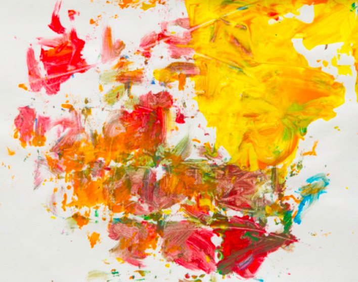
There are formulas, or templates one can use to make abstract painting where it’s almost impossible to go wrong, and opulent effects are guaranteed. Above is a painting created in a fun art environment for the whole family at Akron ArtWorks in Akron, Ohio. Below is one of the world’s richest artist’s newest works at the Gagosian Gallery in Beverly Hills (how appropriate).

True, they are not the same. Hirst’s piece is more deliberate and makes references to Seurat’s and Signac’s Pointillism and supposedly Pierre Bonnard. He had this to say about his inspiration:
“I’ve always loved Bonnard and his colour. How can you not love colour? Sunlight on flowers, fuck everything else.”
Well, Damien, you can start by fucking your own lyrical, abstract paintings, because you haven’t captured sunlight on flowers. You’ve just pelted a canvas with compatible pastel-ish colors. When Damien is at a loss for words in order to convey profundity, he just says “fuck”. It’s worked for him this long, who am I to criticize? I’ll use it a few times in this post in order to match his pugnacious attitude, so he doesn’t have one up on me. I’ll start off saying I like the look of the family fun painting from the Splatter Room better than Damien’s stilted fucking Abstract Pointillist contribution.
Like most Damien’s ostentatious work, there’s an initial WOW factor that quickly subsides into a headachy boredom that sends me scrambling for caffeine. His art is like a sugar high followed by a hypoglycemic attack, in which case the let down is far more profound than the initial high. Instead of savoring the rich aftertaste of the brew, I’m left knowing something’s wrong, and wondering why I feel so miserable.
There is a wide chasm that separates these superficial, merely pretty, formulaic paintings from the best of Gerhard Richter’s abstractions (though Richter’s digital abstractions were absolute shit, and this coming from a digital artist). One of the differences is that Richter knows how to use color, and Damien just started with a palette and method of application in which, well, to quote the advertisement for Akron Artworks, no skill is required.
This kind of template is used by savvy artists to promote their kids as childhood prodigies. Take a gander at this painting by 7-year-old prodigy, Aelita Andre:
Both Aelita’s parents are former Abstract Expressionists who worked on the floor, and so they had a very good idea of how to set up the margins in which their daughter was sure to produce attractive works. There is a market for people who believe in childhood prodigies — all of whom work abstractly — and thus an incentive for enterprising artists to promote their offspring as the golden child who is born but once every 500 years…
This is where I usually insert paintings by chimps, but you get the idea. Oh, no, now that’s not fair of me. You can’t mention a chimpanzee painting and not deliver:
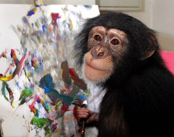
That’s the thing about abstraction, man, you gotta be really fucking good to beat a chimp or a little girl or a family in Ohio with a template. Just having a formula and a threadbare justification ain’t gonna’ cut it.

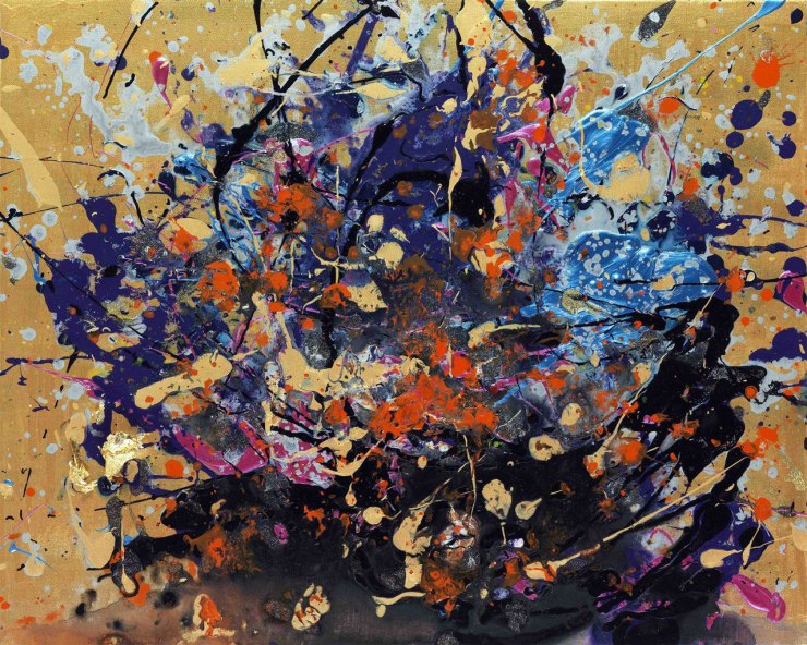
Compare a Hirst painting to one by Richter (above). Richter has elements in the foreground and the background, open spaces and areas of focus. You have blurry colors and sharply delineated ones. There’s obvious upward and downward movement, as well as the trickling lines crossing horizontally. Despite being abstract there is a strong asymmetrical composition. What would you say is the focal point, or the stand out color? Right, it’s the yellow in the upper left.
Now let’s look at the Hirst painting again:
Everything is uniformly clusters upon clusters, all made up of small-ish circles, and so it is not just with this painting, but all of them. There is no variety, no focal point, no movement, no foreground and background. It is the sin of the easiest sort of abstract painting, the all-over composition. It’s kinda’ ugly even, in a way that makes me want to scream. This is because, while the colors can’t really miss, they don’t at all go together like in a Monet or Bonnard painting. The shit-brown, gold, red, and green in the upper right is not sunlight on flowers, it’s fuck everything else. The ghost of Monet has vomited on this painting already. By the way, I inverted the canvas just to prove a point, which is that it doesn’t make a difference.
Have a look at a couple Monet haystacks: And a close-up of a Monet canvas:

The colors are all harmonious, even up close, and in every juxtaposition. There are subtle combinations that allow others to sing more brilliantly. Skill is required. Compare this to a detail of a Hirst Veil painting:

At first the detail of Hirst’s painting seemed alright. Then the gray blobs started to bug me. Then the purple ones. Then the pink. And then I wanted to, let me borrow Hirst’s vocabulary, fucking scream. I can’t look at it. It’s too painful. The placement of blobs is too evenly distributed, just letting the composition form through mindless happenstance. And there are hideous juxtapositions of color in there — not as bad is if he didn’t use a guaranteed-to-pass palette — but just as nasty when you take that into consideration. Once you know the game that is being played, you can evaluate it on its own terms. Look for where the purple meets the green. Yuck! You see nothing like this kind of FAIL in the zoom of a Monet painting, in which every stroke is deliberate, intelligent, and reflects a profound knowledge of color gained through decades of carefully observing nature and mixing colors on his palette. There’s also the texture in Monet’s brushwork: the deliberate direction of each stroke, and the sensuosity of the application, delicately dragged, lightly swirled, or thickly applied. In Hirst’s case there is only one option, the dab, which is just a direct poke.
Let me go with a musical analogy here. I once had a keyboard which I didn’t like. The problem was that the keys were not touch sensitive, and thus however hard you hit the key, the volume was the same. Each dab of Hirst’s brush is the same volume, and so is each painting. Hirst’s two dozen paintings are not a series like Monet’s haystacks, or Bonnard’s nudes, they are more like a bunch of cookies off the same tray. They are randomly different, not intelligently, deliberately, and significantly so.
Even a gum wall is more aesthetically pleasing:

Here’s Damien with a couple of his monumental confetti paintings:

Admittedly, Hirst has a good eye, even a very good eye, but he’s like the prize fighter at the local gym who would be made into a rag-doll if he stepped in the ring with a professional fighter. As the richest living artist, and about the most famous, when he decides to take on Pointillism, Expressionism, and Abstract painting, it is to do so and WIN! This is about conquest, about being the world’s greatest living artist, if not the all-time greatest artist. It’s a sad spectacle when an overinflated second-rate visual artist like Hirst or Koons thinks he is on the same level as Michelangelo (Koons has made such a claim), and then merely delivers schmalz on the grand scale.
Hirst belongs to the tradition of art in which the goal is to outsmart the art world — a game of oneupmanship going back to Duchamp. This never really works because it’s not all that smart to confuse the meaning of art, and hence the meaning of life, with merely outsmarting others. His new paintings are not really about color or beauty, but rather about bolstering the artist’s stature as also a painter. He is seeking to conquer new territory and call himself Emperor, without really understanding the culture he seeks to appropriate for his own glory. He is also offering Beverly Hills homeowners living room fodder, rightly assuming (based on sales) that they can’t tell the difference between a de Kooning and a self-debunking. Radical, dude! No matter how you slice it the terms ugly-ass and masterpiece don’t really go together.
Put Hirst’s ostentatiously titled Veil paintings next to Monet’s or Seurat’s or Bonnard’s and you’ll need a basin under each of Hirst’s to hurl in. They are the visual equivalent of thinking you can haphazardly throw pasta, tomato sauce, cloves of garlic, olives, and Parmesan in a blender, grind the living crap out of it, and then spill the speckled mess in a bowl, call it spaghetti, and name yourself the world’s greatest chef, er, ever!
My advice is to walk briskly through the gallery, in which case you will leave with the impression Hirst really is a very talented visual artist after all, capable of making his own work. Do not look closely. Absolutely do not savor.
If one lingers than there’s the uncomfortable cognitive dissonance of grappling with how far Hirt’s paintings fall short of those of the prior artists he seeks to triumph over with his monumental canvases. At best the paintings are merely pretty, not beautiful, while the size and attached pretense of significance clobbers you over the head. That would be the bombast. And then there’s the all-important conceptual component. Lyrical, all-over, abstract paintings? Huh? Well, made with dots! There’s nothing original there. People have already made abstract canvases by vomiting paint on them, shooting paint out of their eyeballs, sharting paint, and even plopping paint-filled eggs out of their vaginas.
What would save Hirt’s new show is if the paintings were done astoundingly well. They weren’t. They were done passably well if you don’t look too closely. They especially fail in comparison to the competition, falling well below Monet and somewhere between child prodigy and chimp art.
~ Ends
If you like this sort of independent art criticism, that doesn’t need to answer to anyone and has no outside limitations, consider throwing me a bone. Through Patreon, you can give $1 (or more) per month to help keep me going (y’know, so I don’t have to put art back on the back-burner while I slog away at a full-time job). Ah, if only I could amass a few hundred dollars per month this way, I could focus entirely on my art and writing. See how it works here.
Or go directly to my account.
Or you can make a small, one time donation to help me keep on making art and blogging (and restore my faith in humanity simultaneously).

If an advertisement appears below, I have no control of it and get no proceeds.

..but Eric if you would just squint and stare and gaze upon Veil of Love’s Secretes (sic-me) a ‘fucking’ 3D shark will appear…in a glass tank! Ah, man…the transcendence! Thanks for lifting my spirits today! :^) *I’m tempted to add dunn dumb, dunn dumb, duunnnn dumb. Y’know Jaws*
LikeLiked by 2 people
Eric,
I agree this is a bad painting, but I think it is more pointillist than drip. I think it’s possible to do a good pointillist painting but this one fails for me because it seems like he was just trying to make the brightest, most colorful painting he could make. That’s fine for beginners but I would expect more from someone who is considered a great artist. I need some heart and soul. I think the Pollock style of flinging paint lends itself to that a little easier. I do like pollock quite a bit, but he did paint himself into a corner that he couldn’t get out of. A few years back I did a series of pollock style paintings that I took a step further that I think are pretty good. I’ll put a couple of them on instagram so you can take a look at them. I know you don’t critique people who ask to be critiqued,. I’m not asking you to, just thought you might like to see them.
LikeLiked by 1 person
I think we are in agreement here, and we don’t need to be. I’m really starting to appreciate more that each person is their individual ism, so to speak, if they are any good.
I wonder if I should have been a musician (except I can’t even remember tunes I whistle one day to the next!), because the kernel of my art criticism is just to compare everything to music. So, I’ve been thinking about bands that I really like, but who make music I never would. If I were a rock musician in the past I probably would have made progrock with metal and experimental influences. I definitely would NOT have made music like Steely Dan, the Bee Gees, or Elton John, and yet I love their music (some of it).
I’ve probably said this already, but I think a lot about Van Gogh and Gauguin and their fights over art. Rather than trying to convert the other artist (if they really were doing this, or one way), they should rejoice in their differences and originality.
Also recently I’ve noticed very clearly that my favorite artists are all the type that are not really a part of an ism, but rather individuals who express their idiosyncratic window on the universe in their own way, which may overlap with current styles but are also highly particular.
I don’t think I’ve found you on Instagram. I don’t think I’ve ever seen anything you’ve done. What’s your Instagram name?
Don’t worry. I won’t crit it. It also sounds like something you were doing as an exercise, on one level. I like that you explore different approaches.
Yeah, I agree about Pollock painting himself into a corner. I’ve said that about most or all the Ab Exers, the whole thing about having a signature style and staking out a certain narrow method of applying paint for oneself, branding it, and copyrighting it, so to speak.
Cheers.
LikeLiked by 1 person
“The ghost of Monet has vomited on this painting already.” Haha this sums it up, really.
I kinda wish more amateur painters learned that magic formula that Aelita Andre is using, for everyone seems to think they can rock at abstract art.
LikeLiked by 1 person
Abstract art is like instrumental music. You are dealing with less than when you have subject matter, in which case you have to do a lot more with it. Hirst is relying on his idea of “veils” and his pretentious titles forcing the viewer to read more into the images than is there. It doesn’t work. And I guess that’s a tactic he has always used.
LikeLiked by 2 people
Eric,
Try looking for me by Matthew Berbee. I don’t put a lot of stuff on Instagram because I only have 4 or 5 people who look at it. I’ll try to put a few more up so you can see the evolution a bit.
We do agree on most things art. I think that’s partly because most of our favorite painters are the same. We definitely have similar tastes, but you’ll see that our art is very different.
LikeLiked by 2 people
I found you. If you want more likes and followers you gotta’ go out and like a bunch of other people’s stuff. It’s all “you scratch my back and I’ll scratch yours”. The idea that art will get attention for being good, no matter how good it is, is some sort of fantasy, apparently, especially now that Instragram has implemented new and sponsor friendly algorithm.
Anayway, I found you and I noticed two things right off, which I think I can be free to say since they are so obvious. One is that your use of color alone is enough to carry your art. Two is that you do something different that I haven’t seen before. And how rare THAT is!
I wrote an article about the self-defeating logic of Instagram, which is more about users than the platform, and that’s just that most people who have elected to follow me and stopped following me if I didn’t follow back. In that case their follow is meaningless.
That said, if you support a bunch of other people by liking their stuff (don’t be too picky), than some of them will come and look at your stuff.
Sometimes I play the game for a little bit, and then I get bored of it. Mostly I put my energy into my blog. And look where that has gotten me in around 5 years! Oh, um, never mind.
I look forward to seeing more of your paintings!
LikeLiked by 1 person
Eric,
Thanks for taking a look. The backgrounds have been a constant evolution. For the smeared ones I get the paint thinned out so it pours. Then I smear it with my hands, and anything I can find. A stick, a trowel, a paint roller, a fly squatter or anything that happens to be within my arms reach at the moment I’m painting. It’s extremely messy, but I love it. I couldn’t recreate any of them if I wanted to. I think that’s why they are changing so fast. The idea came from doing watercolors with the paper wet before putting the paint on. Just watching it do what it was going to do. Anyway I’ll put some of my watercolors up in the near future. I think they are my best works.
LikeLiked by 2 people
Cool! Ah, man, I have to start teaching again in a couple days. It’s a mixed blessing because it’s part time and I’ll make some money, but it takes a good chunk away from doing whatever I want. May have less time to go on about art, and have to use my time wisely to just make it.
LikeLiked by 1 person