
Yeah, I don’t know this artist, and I’m posting about him as I’m researching, without doing much if any reading about him. I only know him because of an attacky sort of comment someone made on one of my articles dealing with Duchamp, and the whole supposed revolution of art his urinal spawned. The guy accused me of “subscribing” to whatever Tom Wolfe wrote in “The Painted Word”. I wrote my smart-ass retort, and then dutifully looked up whatever-the-fuck Tom Wolfe had written.
Wolfe decried the demise of the visual in art, and it being replaced by theory. He boldly concluded that artists were making paintings to illustrate ideas by critics, mere props for art theory. He had this epiphany upon reading a review by art critic, Hilton Kramer, of a show of realist painters, including Bechtle. Kramer had basically asserted that without being underpinned by a cohesive theory, painting was unhinged and irrelevant. He included wonderful quotes of critics at the time savaging the realist painters.
Yup, I think Wolfe had a point there, no matter how unfashionable that point was. In my rejoinder to aforementioned little challenging comment, I accused the other party of valuing ideas about art over art, so, to his credit, he was actually correct that I agree with Wolfe (on at least some points, and likely disagree rabidly on others). So, naturally enough, I wanted to see what these artists who the art critics thought were complete shit made. I already knew Richard Estes, so did a Google image search of Bechtle, and a slide sheet of visual snippets of my childhood materialized.


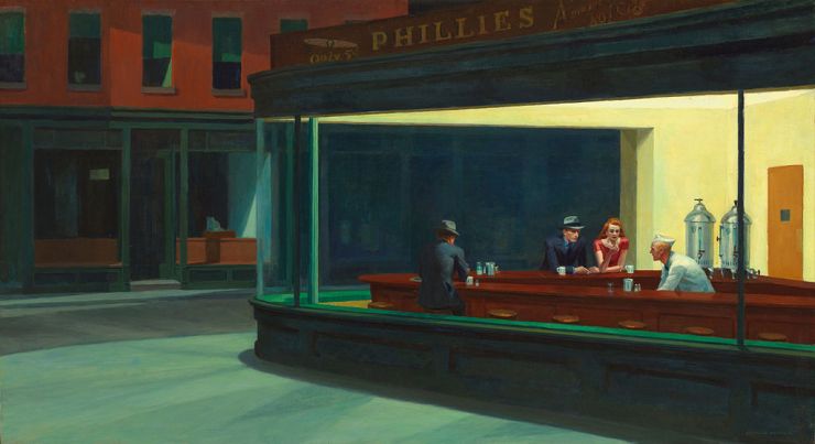
One thing I noticed right off is that the paintings look like they were done from Polaroids, which gives them a very characteristic look, which is nostalgic now, but at the time must have been a device to document not only the image in question, but the fact of the mechanical filtering process of the Polaroid. Then one can see the influence of Edward Hopper in the treatment of geometric shapes created by architecture, and specifically planes of light and shadow.

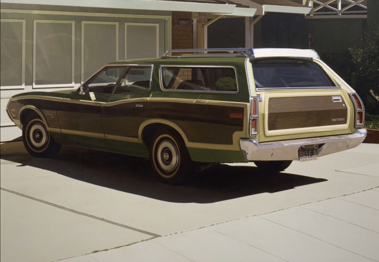
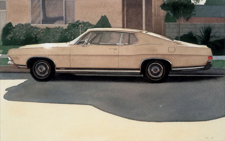
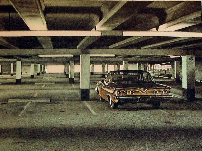
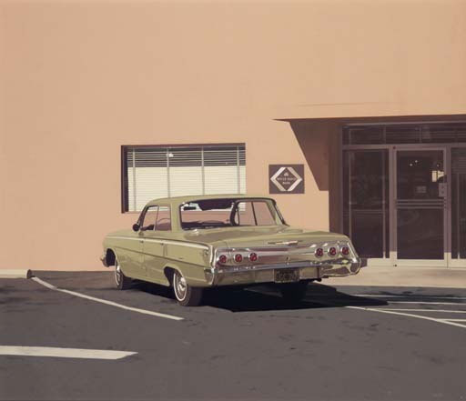
In the painting above Hopper’s even got a car in it. It’s all angles, light, shadow, and reflections. It’s quite easy to see how Bechtle follows Hopper in rendering a particular time and place, and emphasizing the little details that breathe reality into it. In Bechtle’s paintings, like “73 Malibu” you can read the address that the parking garage belongs to, as well as the numbers for the parking spaces. And in ‘Alameda Gran Torino’ you can read the license plate. As with Hopper, all the planes and lines are arranged in a coherent, and appealing way. Bechtle heavily relies on the inherent aesthetics of the automobiles themselves, which if a critic wasn’t such a dick about Duchamp, he’d realize this reflects Duchamp’s own notion that an artist can’t hope to compete with an airplane propeller. Clearly, Bechtle luxuriates in the everyday beauty of the automobile, the garage door, the strip of grass, the door handle, the side paneling, and above all, the tail light!
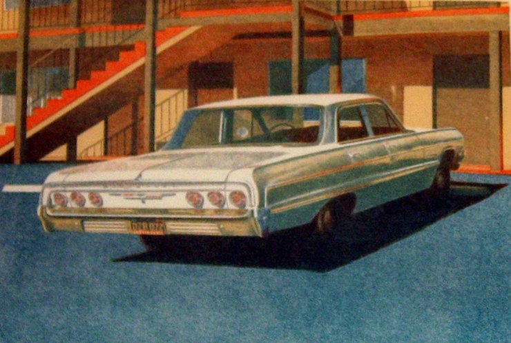
Here I think the car stands in for the individual. Those old cars had a lot of personality, before cars all came to look like a cross between a shark and a sporting shoe. Often the front end had a face, with the headlights as eyes and the grills as mouths. I suppose as a working class kid who spent years while I was in elementary school playing in the back parking garage with other kids in my apartment, I did a lot of looking at cars. What do you look at in your cement back parking garage? Planes, light, patches of sky, car spaces, license plates… Point I was getting at is that growing up with these cars I looked at them really a lot, and interpreted them as having personalities. So, in these works I also see them as stand-ins for people. We know the parked car belongs to someone who will return to it, sit in the driver’s seat, start it up, and sally forth in it as a sort of single unit.

and

Hockney stresses the formal to the point of idealized illustration, and I don’t relate to his work at all in the same way, but if someone can appreciate the formal aspects of Hockney, they may notice the same attention in Bechtle’s paintings.

The critic won’t care that much about that aspect, or the wonderful treatment of the oil stains, the lines of paint demarcating the parking spots, the door handles, rear view mirrors, or the tail lights. Instead, he or she will try to think about what the painting is in terms of contexts and definitions. They will conclude that it is a photo-realist painting of something approximating a snap shot, and they can stop looking at the painting at that point. The real work of interpreting its relation to everything else would be the primary consideration. They will think about the subject matter – it’s inescapable – but just as another facet to interpret in the greater context. The art for them has no autonomy or inherent qualities, it is instead a statement or argument within an art historical debate, and there is a foregone conclusion which this art probably is on the losing side of – dead on arrival.
This is why critics at the time panned fellow photo realist Richard Estes with these choice denunciations: “Return to philistinism” . . .“triumph of mediocrity” . . . “a visual soap opera” . . . “incredibly dead paintings” . . . “rat-trap compositional formulas” . . . “its subject matter has been taken out of its social context and neutered” . . . “it subjects art itself to ignominy” . . .


![58 Rambler [1967]](https://artofericwayne.com/wp-content/uploads/2015/11/58-rambler-1967.jpg)

Bechtle’s cars also remind me of Impressionist studies, such as Monet’s haystacks, in which you see similar subjects at different times of the day. But for the art critic, the focus needs to be on what is “radical”, so comparisons with Monet or Hopper are going to be deleterious. We must be “on the cutting edge”, “breaking new ground”, and changing forever the way people see. None of that really has much of anything to do with what is intrinsically good about art. I don’t give a flying crap load about whether any of my favorite songs are considered important, or even relevant to music history. To me that is as appropriate an approach as preparing and eating food based purely on nutritional value, and irrespective of taste.
Bechtle painted other things besides cars, and he went on to paint more modern cars with less character. All his work is solid, but the cars from the 70’s are my favorite. Many of the critics were wrong, and brimming over with their own bullshit and hype. They are like religious fanatics who automatically dismiss the culture of other religions.
All the dumb-ass rhetoric, pigeonholing, mental masturbation, and fealty to a faux linear progression of art history put aside*, the car paintings are wonderful. And I forgot to mention that I think it’s odd I’ve never heard of this artist, even though I have an MFA. The reason is, of course, that he wasn’t considered relevant to this or that narrative or agenda about which artist is important to art history. I think it’s time to toss out all that rubbish, and appreciate visual art through looking at it, and not thinking about it when we are not even looking at it.
Here’s a gallery with all Bechtle’s paintings from this post, plus a few extras, that you can click through.

![58 Rambler [1967]](https://i0.wp.com/artofericwayne.com/wp-content/uploads/2015/11/58-rambler-1967.jpg?w=261&h=241&ssl=1 "58 Rambler [1967]")


* This article is art criticism, so obviously I’m not totally against it, just the variety that buys into a linear progression of art history and dismisses painting and visual language art in general as made irrelevant by conceptual art…
~ Ends
And if you like my art and art criticism, and would like to see me keep working, please consider making a very small donation. Through Patreon, you can give $1 (or more) per significant new work I produce, and cap it at a maximum of $1 a month. Ah, if only I could amass a few hundred dollars per month this way, I could focus entirely on my art. See how it works here.
Or go directly to my account.

Or you can make a small, one time donation to help me keep on making art and blogging (and restore my faith in humanity simultaneously).


I didn’t read the whole article — but isn’t Google great for quickly finding out stuff? Who says you have to agree or disagree with everything anyone says? You take some and you leave some: It is totally possible to agree with what a particular critic says about one thing and disagree with him/her about some other opinion.
LikeLike
Yes, we are lucky these days that we can explore art and ideas so easily with the internet. And, agreed, we my agree and disagree a lot with a critic. My favorite critic is Robert Hughes, which is a rather obvious pick. I love the way he picked apart Koons and Hirst and called Warhol “stupid”, but we still have very different tastes in art. What I AM opposed to is the general belief system about art that I was subjected to and indoctrinated into in art school by which some art is important art historically, and then everyone deliberately tries to make art history instead of art, and it’s all rather shallow.
LikeLiked by 1 person
Yah, and don’t get me started on the moniker, “outsider art!”
LikeLike
Yeah, I remember you have some issues with that.
LikeLike
Hey! Did u see the recent NYT book review about ur fav critic — Robert Hughes? link: http://www.nytimes.com/2015/12/04/books/review-in-robert-hughess-the-spectacle-of-skill-an-aesthetes-unsparing-eye.html?_r=0
LikeLike
Thanks for sharing. I hadn’t seen it. Sounds like the book wasn’t really intended to be seen as is.
Yeah, I really like Hughes for taking the art world to task for being overrun by the wealthy, and of course for his criticism of Koons, Hirst, and Warhol. I wish we had more outspoken, colorful, persuasive, entertaining, and daring art critics. I’m sure there are some out there I haven’t discovered, but the big shots I do know I’m not overly fond of.
LikeLiked by 1 person
I also like that he took to task, JM Basquiat. I have always wondered if Basquiat’s work would’ve taken off eventually or if it only took off because of Andy Warhol. I like that Warhol believed artists ought to be paid for their work but apart from his drawings, I don’t really like his ads, er art.
LikeLiked by 1 person
I’m sure it really helped that Basquiat was close to Warhol, but he might have done alright on his own if he could have gotten off the ground on his own. He was rather lucky in being in the right place at the right time.
LikeLike
I know! He was pretty savvy, hooking up with Warhol. (I thought for sure you were going to write “Warhola” since you like that word so much!
LikeLike
Oh, I guess I’m not entirely predictable. Both Warhol and Basquiat were quite lucky to find success so easily.
LikeLiked by 1 person
Hi Eric, well done sir! Excellent post.
As to who is important or not important throughout art history – it’s fluid. We value only what our current society filters through as valuable, or important or yadda, yadda, yadda. An artist is considered the penultimate, then forgotten (in many cases for a couple hundred years) only to re-emerge because something they did speaks to the value system of the then current society.
In fact its a very small cadre of people on the planet who actually tell us what is good art, bad, art, important art, investimentable art. And 99% of those elite do not themselves make art. It seems we never really leave high school – we keep voting for who is king and queen of the prom and deals are cut behind the scenes to make sure this artist or that artist is “important”….or good….or, well you get the idea.
Same in history of music. It’s in, it’s out, it’s in….. So it doesn’t really matter, if you are an artist – as you simply are doing what you do. Should someone like it, ok. Should someone love it, that’s nice. Should someone buy it – it helps pay the rent. But it does not in any of those cases make a difference on the actual value of the art you’ve made. It’s value is its ability to speak of who/what/how you are to another person in some transcendent way, in someway that “they get it”. They understand. They are increased by what you did.
Excuse my pontificating but you struck a chord as to the “emminence front”, the artificialness of the ‘art world’ at any given moment in time.
Cheers and keep up your good work!
Douglas
LikeLike
Thanks, Doug. Glad you found this article. I think you are probably mostly right about how a relative few people decided which art survives and which is relegated to the dustbin of art history. They won’t give me the time of day. However, with the internet, people such as myself who are hungry for new art and music can discover unrecognized or unappreciated talent (just as you found this article), in which case even creators who are not embraced by those making the key decisions right now, can still be appreciated by a few, hither and thither. It’s better than nothing, though not by that much.
LikeLiked by 1 person
Excellent thoughts Eric! So true. I can only say you just keep at it. PS On my art quotation blog I was reminded of this entry: https://artofquotation.wordpress.com/2015/04/20/the-notion-that-the-public-accepts-or-rejects-anything-in-modern-art-is-merely-romantic-fiction/
Here’s to ongoing inspiration and productivity !
LikeLiked by 1 person
I like what you say about the cars waiting for the personalities of their owners to turn up. What I appreciate about these paintings is how they’re static, and at the same time, scenes. The action is acheing to happen. It’s Hitchcock mixed in with a 1970s cop-drama stakeout. A lot of this is in what’s not there – the absence of drivers, the empty expanse of tarmac or wall, sometimes even part of the car itself. It all makes space for the mind to wander in. Reminds me a lot of George Shaw, whose idiom is of course British instead, so grey and overcast rather than sunlight and harsh shadows:
http://www.bbc.co.uk/arts/yourpaintings/artists/george-shaw
LikeLike
That’s an interesting comparison with George Shaw, and also with Hitchcock. I’m thinking about how our geographic locations might color our feelings about the paintings. Shaw’s paintings do not look like home to me, but they may to you. But when I was growing up my parents had a 66 Chevrolet Nova (they still have it), which would fit in perfectly with all of Brechtle’s cars. And the paintings have that California light, and the sort of housing that was so popular at the time but now looks dated and crappy. But he is in essence doing something very similar to Shaw, just in a different environment and with a somewhat different subject.
LikeLike
Thanks for finding him and sharing him with us. A fantastic artist. I love his work, too.
LikeLiked by 1 person
Oh yeah. Tis the least I can do.
LikeLiked by 1 person