
One of the very best artists I’ve discovered through prowling around on the internet (in this case at Deviantart) is Andrew Newton, who did rather tight photo-realistic paintings in the past (the type that show every wrinkle, reflection, and wayward hair); but whose new work has broken out imaginatively into new terrain that faithfulness to mundane reality alone would never have taken him. The new works are wild, a tad violent, a little gross, and yet overall fresh. His new creations show the influence of the 20th century masters of experimental figurative and representational art, such as Chuck Close, Gerhard Richter, Lucian Freud, and especially Francis Bacon. While his early work was strong in the Chuck Close, hyper-realist vein, the daring new Bacon/Richter influenced works show real promise going forward, and also represent Andrew’s venturing off in his own trajectory. I dare say he’s learned from the masters, assimilated their teaching, and begun to take it in a new, uncharted direction.
A while ago Andrew and I corresponded about his work, and he invited me to blog about it.

Chuck Close had an obvious influence on Newton. Close’s art style fit his name. He got in close. Real close. And he rendered every hair, pour, and wrinkle in mindbogglingly tedious detail. He outdid the camera, proving once and for all that humankind can beat the machine at what it’s best at. The camera could not focus on each detail, decide how much to emphasize it (or not), and infuse it with the artist’s attention. His canvases were enormous. The image on the left above towers at seven feet high. Here is a monument to the artist’s most careful scrutiny, whereas the camera, faithful as it is at reproducing the appearance of external reality, shares with the chess computer a complete unawareness that it is even operating.
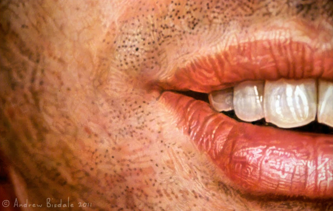
Nearly 30 years later Andrew Newton painted Cathy (above right) in a similar approach. Andrew, however, took the plunge of honing in on just a section of the face and particularly the reflections on the glasses. There are even reflections on the eyes beneath the reflections on the lenses. The attention to the eyelashes, mascara, veins, wrinkles, freckles, and every frazzled hair is unsettling and overwhelming. It’s “too much information”. While Close made a monument of his subject’s identities, as if projecting them onto the big screen for posterity, Newton eschewed the identity for the texture of the flesh and glitter of the accouterments. The sitter was no longer set apart from reality as a unique persona, but became subsumed into, and indistinguishable from, a singular physical existence. It’s a philosophical as well as an artistic statement. Andrew didn’t stop there. He continued to explore the relationship of the individual and reality, and began to incorporate elements of accident, and randomness.
The influence of Francis Bacon is as much philosophical as it is pictorial. The most obvious connection with Newton’s new work is the introduction of accident, in the form of unforeseeable outcome. Bacon would sometimes fling white paint, straight from the tube, onto the canvas as a finishing touch.

Newton uses his own method (which I will detail later) to introduce chance and unforeseeable elements into his work. This decision signifies acknowledging the unpredictable nature of existence, by integrating it into the process. The non-deliberate aspects add a degree of shock to the composition, just as an accident jars us out of our normal routine. More obvious than that, however, is the overall look of Newton’s new work, which is highly reminiscent of Bacon. The distortions of the subject’s visages, such as their mouths getting stretched and contorted with swatches of vigorously applied paint, are chief among the similarities.

Another powerful influence on Newton must have been the painted-over photographs of Gerhard Richter (unless this is a parallel development). Richter painted over generic snapshots to create the impression that the paint is both in the picture and on it at the same time. He used unconventional means to apply the paint, such as wiping it on, or pressing it on with another surface and lifting it off. In the photo below, the purple swatch of paint gains the quality of a gloppy, plastic wave, because of the colors it echoes from the water, blue-green plastic cup, and the deeper blue toys.

In the next image, Richter used the red of the baby’s clothes as the impetus for his lava-like intrusion of paint onto the mother and child. In particular, the globs of paint on the mother’s face resemble the effect Newton achieves. The primary difference between the respective bodies of work of the two artists is that Newton’s works are not painted-over small photographs in their entirety, but painted-over large paintings of sections of photographs.

The painting below by Newton shows the influences of both Richter, in terms of painting over an image; and Bacon in the flinging of white paint that is his trademark flourish.

Now let’s take a closer look at a few of the startling new pieces he’s produced.

Oh no! Ouch! Yuck! I don’t wanna’ look! And yet… it’s beautiful. As a painting this has a lot of vitality: vivid color, energetic brushwork, and a variety of methods of applying paint (such as pressing it on with something like a cloth). But the effect is as unsettling as a graphic photo of an operation. The thick red line under her eye, and the reds and whites coming together in a mash of pigment, suggest injury, shock, and the unforgiving randomness of reality. Francis Bacon often spoke of the “brutality of fact,” (Bacon was once completely overwhelmed by the sheer “beauty” of the blood on the pavement after a car accident) and this kind of existential cruelty is evident in Andrew’s new work, which not only takes a microscopic look at mundane reality as it appears, with all it’s unappealing imperfections, but integrates random accident in the non-representational segments. Despite the process of grappling with reality contained in the work, the result, no matter how graphic in its feel, is nevertheless beautiful. THAT is what makes this work so powerful. It’s so ugly it’s beautiful. There is a beauty even in quotidian existence and the freak accidents or misfortunes that disrupt the fantasies of order and coherence we impose upon naked reality.

This piece is another punch in the face, jolt of reality, replete with paint suggestive of blood and contusions. Where’s the corner man? I think this boxer is ready to throw in the towel. Humor aside (he’s not really a boxer), this really does speak of the potential of injury. As with the painting of the woman with a mug, the subject is frankness incarnate. We have the one, unflinching eye fixed on us, while the other is obliterated in a wide swatch of viscous paint trail. Andrew said this in his description of the painting:
I want the painting to look like its been attacked from an outside source, and so morphed into something more. I feel this is the way I want to demonstrate a realistic perspective of someone, part detailed and part deformed from the minds eye.

When I said that the work has an element of violence, I definitely didn’t intend that the artist wishes violence on his subjects. If anything, I’m quite confident he wishes them anything but that. Rather, he addresses the violent nature of reality itself through his cooperative subjects: the surprise of the unveiled actual. In his early paintings he appeared to want to face the mundanity of life, look under every rock and in ever corner for whatever ungainly or horrific spectacle he might find. The new pieces goe further, tapping a crack in that reality, out of which a stream of paint gushes. Something’s broken through. It is this attempt to grapple with engaging the nature of existence through imagery, trying to convey a philosophical understanding with pigment and brushwork, that I find so appealing in his work. And what exactly has breached the surface he’s so painstakingly recreated? I don’t know. On the naked surface, however, this image almost looks like a woman was slapped across the face while eating jelly beans. One can’t entirely escape lingering scenarios of domestic violence, and one of the white squares in the abstract section could easily be a dislodged tooth. As in his earlier work, Andrew tries to capture the subject in a sudden, un-posed, natural instant, then labor over that instant and blow it up to gigantic portions. Below is a view of his studio while he has worked on such images.

Andrew’s painting method is as startling, (and even counter intuitive) as his images.

If you don’t know, the subject of this image – Nick Drake – is a phenomenal singer/musician who suffered from depression, was reclusive, and died at the age of 26 in 1974 from an overdose of a prescribed antidepressant. He got no recognition in his short lifetime for his unique and irreplaceable music. Despite the sad facts of the subject’s life, he is treated to less existential violence than the other subjects in the series. The paint that “attacks” his visage is composed of natural greenish and purple colors. In this case the release from the prison of factual reality, which the splash of paint may represent, could be the same outlet as his creative brilliance.
So far I’ve neglected to address that the “abstract” swatches of paint that appear superimposed on the portraits, also exist on the surface of the picture plane. This serves to remind us of the dual nature of the art in question: it is both a realistic representation of the subject in three dimensional space, AND it’s a bunch of paint heaped on a canvas. The dual nature of the image signals the duality of the method and message as well.
First let’s tackle the method. Andrew paints the subject based on a photo. He puts a grid over the photo, makes the same proportioned grid on the canvas, and then uses that as a guide to faithfully reproduce the image. I’ve used that same technique (though it’s much easier to use a projector).

The next part is where it gets more interesting. Andrew wrote me about his process for realizing the abstract elements. He doesn’t do the abstract part lastly, on top of the portrait, but first, then builds the portrait around it:
What I do to create the separated abstract effect is I cover up the image mostly in newspaper and tape only exposing part of the image I want with the abstract pattern/forms in. So basically I create my own abstract piece without reference to the portrait/image under the newspaper. So this gives a vitality and indelible random sensation which is what I want. I guess there is anger involved as the emotion when I create the abstract section is very violent compared to the sensitive handling of the realist part of the painting. Maybe the sharp contrast is to illustrate the fluctuation of emotion in life, as well as the minds ability to switch from obedience to ignorance in a short space of time.
His description pretty much sums it up. What fascinated me here though, is that he creates the abstract element without really knowing exactly how it’s going to integrate with the portrait. As he described it, he masks out the background (portrait area) with tape and newspaper, then makes the more painterly, non-representational swatches first. This is how the “random” element is introduced, both in concept and in process. Because he can’t know how the “abstract” portion and the realistic depiction will integrate, it must signify that the random, or “chance” element usually does violence to the “sensitively” rendered figure. It’s as if the freak nature of reality, which is always stranger than fiction because it eclipses our imaginations, necessarily crushes the staid concept of a stable and consistent existence. At the same time, that threatening chance element also brings a kind of wild freedom into the images, bursting through the image like a blade of grass that erupts through cracks in the sidewalk. Those abstract swatches are both dangerous and liberating, waking us up from both peace and slumber.
Just when I thought I’d done a decent job of presenting Newton’s work, he uploaded a new piece (exactly 15 hours and 9 minutes ago) that is unlike anything I’ve seen from him before.
The new piece (below) is of the caliber of his best works, but requires a different interpretation. I’m intrigued and challenged by it. Here’s is what the artists wrote about it:
Here I combine a Hyper-realistic interpretation with a deliberate abstract square shape obstructing most of the subject from view. I did this to make a bold statement about loss of identity in the 21st Century, and depicting a young attractive woman was a comment on ideal perfection fragmented by modern lifestyle.
Nearer the bottom of the painting the image starts to deteriorate into a sharp turquoise colour. This again to show fragmentation and also structure being invaded by pure colour, symbolising disarray (a common feature in my work).

The instant effect this image had on me was attraction/repulsion. The unquestionably beautiful green eyes lure one in, but the square mask of chaotic, brash color pushes me back. This time the whole head is in the frame of the picture, and it’s square on. Instead of the signs of ageing we are usually confronted with, we have a flawless, conventionally beautiful model. Her look is the cold, unfeeling and unflinching stare of a Terminator or a Stepford Wife.

Lyrics from The Zombies “She’s Not There” come to mind:
Well let me tell you ’bout the way she looked
The way she’d act and the colour of her hair
Her voice was soft and cool
Her eyes were clear and bright
But she’s not there
And the square, it’s like a circuit board, and it’s where her mouth and nose would be.

Because of this placement of the square, abstract painting, and the texture which is abrasive compared to the flesh of the woman, there’s something like the sense of pressing ones lips to a motherboard. But it is also like a giant mouth that can devour you. Images of The Predator’s mouth, which opens into a rectangle, come to mind.

The deep reds in the abstract portion still signal violence, but it’s no longer the tooth-dislodging blow to the face of the prior series – this time it’s psychological. Instead of the over-painting looking like something that happened to the woman, it looks like it’s a part of her. The square-within-the-square composition coupled with the straight-on view of the woman creates a very rigidly formal composition that reads as mechanical and technological. Additionally, because the woman occupies the outer square, she becomes the frame, and the square the actual subject of the painting.
The artist says it’s about “loss of identity in the 21st Century,” and I’m getting that what one’s identity is lost to is bombardment with media via technology. The woman looks like a model in an advertisement, and at the core of her being is static. She is artificial. Her consciousness is frazzled with endless interaction and absorption in technology.
But this must extend beyond just the woman in the portrait, or women. This is a statement about the human predicament in the new millennium (at least among the dominant culture). Perhaps we are no longer the Hollow Men of T.S. Eliot – overstuffed, citified, domesticated, and detached from the immediacy of the struggle for life. We’ve drifted further, into a false, technological reality driven by advertising and propaganda; and composed of a tumult of abstract, cerebral thoughts. I may be out on a limb with this interpretation, but, “21st Century” is the kind of painting that makes a philosophical statement. I find it captivating, and like a puzzle I want to return to again to try to solve.


You can follow Andrew Newton on Facebook.
His Deviantart account.
His website: Andrew Newton

Wow! I see where you get the impression of violence, particularly on “Study of Lara”, but, to me, it’s the viewer getting slapped, not violently, but with the realization that reality can get interrupted. On the other hand, my mom would probably say, “He had an oopsy!”
LikeLike
I agree, David. They are kind of jolting, like a slap. They are raw and confrontational in terms of how much we are confronted with the person’s corporeal existence.
LikeLike
You write very well. In fact, probably one of the very best art writers around at the moment. Shame you aren’t writing for an art magazine.
Anyway, as I was reading the post, I found myself wondering whether Newton’s work would be as impressive if instead of using paint, he just took a photo and then used photoshop to abstract segments of it. Personally, while I can appreciate the kill, from an audience’s perspective I would have to say yes. Just as a piece of furniture made without the aid of power tools is more difficult and can be appreciated on that dimension, the furniture created with the aid of power tools is usually superior.
LikeLike
Thanks for the compliment. If my art criticism is any good, it’s probably because I come at it from the perspective of an artist.
Your comment raises so many interesting questions it’s hard for me to answer it at all. Even though I work digitally, all my training throughout my MFA was in traditional art, so my approach to digital art is very hands on and meticulous. I don’t think this is true of most artists working with digital media, and there’s a high propensity for slick-ish photo-manipulations that bore me to tears and give digital art a bad name (I don’t need to see any more unicorns or stuff like people with wings and gas-masks rising up out of flames). One could tackle some of the same philosophical ideas as Andrew Newton, using the computer, but I think it would end up looking different. Newton’s art comes out of, and continues, a tradition of figurative oil painting that is not only beautiful, but challenging, both aesthetically and intellectually. At the core of that kind of work is a virtuoso handling of paint. It’s a kind of language, and not only is his message being communicated in that language, the manipulation of the specific language is part of the message. In other words, his work is also intrinsically about oil painting and the history of oil painting. Thus, to render the message not in paint would be to unravel an integral strand of the intended meaning.
(Oddly, though, a lot of my digital work is also about that tradition. But I’ll save for another time a defense of digital art as a very serious and potent form of visual art.)
LikeLike
Looking forward to your post about digital art one day and will save some comments for then. As for art writing, I suppose I appreciate your work being an artist myself. As an artist, I am interested in art theories, art history, visual languages, concepts and ideas; however, I find lots of art writers sort of take the role of a promoter and write boring profiles of where the artist went to school, awards they’ve won etc or flowery waffle that doesn’t make sense but makes the artist sound like a genius.
LikeLike